A Review of Fabrice Rimlinger's Sparklines for XL
 Please don't be confused by the title of this post. This is not off topic. This post is not about the lyrics of a 25 year old Bruce Springsteen song. It is the first of two posts on using sparklines in professional Business Intelligence dashboards.
There is more than one way to heat a map recently described – among other techniques – how to use Fabrice Rimlinger's brilliant open source Sparklines for XL to create a 2-dimensional tabular heat map with Microsoft Excel. Back then I announced that I will have one or two more posts dedicated to Sparklines for XL here on Clearly and Simply.
This is the first one, a brief review of Sparklines for XL.
What are Sparklines?
For answering this question, I will not even try to keep up with the real experts and aficionados of data visualization and dashboards. Thus I am limiting myself to provide a link to the website of Prof. Edward R. Tufte and a short excerpt from Stephen Few’s excellent book Information Dashboard Design:
“Tufte describes sparklines as 'data-intense, design-simple, word-size graphics.' As such, they are ideal for dashboards and anything else that requires highly condensed forms of data display […].
[…] Sparklines are not meant to provide the quantitative precision of a normal line graph. Their whole purpose is to provide a quick sense of historical context to enrich the meaning of the measure. This is exactly what's required in a dashboard.”
Stephen Few, Information Dashboard Design, O’Reilly 2006, page 140 -141
For further details on the theory, the concept and the practical use of sparklines, I highly recommend Prof. Tufte's book Beautiful Evidence.
Stephen Few's Information Dashboard Design has only a few pages on sparklines, but it also provides some beautiful dashboard examples using sparklines. In any case I recommend all of Stephen's books and articles. For anyone who has to do with data visualization, any of his publications is extremely insightful and always worth reading.
What are Sparklines for XL?
Sparklines for XL is an open source installation of sparklines for Microsoft Excel provided by Fabrice Rimlinger. Download Sparklines for XL for free here.
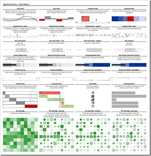
The following chart gallery gives an overview of the most important chart types included in Sparklines for XL:
Different options, e.g. to add lines, add data labels, change colors, change the orientation from horizontal to vertical, etc. allow a countless number of different variations of the chart types. Nevertheless this little chart gallery should give you a pretty good impression of what is possible with Sparklines for XL.
For more information, examples and an exact description of the syntax download the manual here.
How does it work?
The basic concept of Sparklines for XL is not to create and tweak standard Excel charts.
You could produce most of the sparkline chart types with plain old Excel as well. A simple classic sparkline, for instance, could be created with an Excel standard line chart by removing everything from the chart but the line itself (axes, data labels, gridlines, legend, etc.) and reducing the size of the chart. Even more complex chart types like the bullet graphs or box plots are possible with Excel by using calculated dummy data values and some chart tweaks. But this is laborious work, especially if you need a lot of charts on your dashboard.
Fabrice's Sparklines for XL are based on a different concept:
-
Sparklines for XL provide so called user defined functions (UDFs) implemented with VBA. After enabling macros or installing the add-in, you can use the sparkline UDFs exactly in the same way as you are using Excel's standard functions like SUM or VLOOKUP.
-
The UDFs create shapes according to the size of the cell and the specified parameters, like the data, whether or not you want to have tags on your chart, the color schemes, etc.
-
All these shapes are grouped to one object and inserted into (or onto?) the cell with the UDF.
-
Whenever the workbook is recalculated, Sparklines for XL delete all existing shapes and recreate them to make sure the displayed charts are up to date.
The sparklines on your worksheet aren't Excel charts. They are groups of different shapes likes lines, rectangles, text boxes, etc. This is a pretty clever concept since you do not have to create the additional dummy data series you would normally use to make a more complex non-standard Excel chart (like a line chart with a shaded background).
There is one disadvantage though. Deleting and recreating the sparklines after every recalculation takes more time than Excel would need to update a (tweaked) standard chart. The performance of the workbook decreases when using Sparklines for XL and updating the charts is less fluid as it would be with standard Excel charts.
What do you have to do?
Using Sparklines for XL is pretty easy and needs only a very short preparation:
-
Download and install the add-in or download the stand-alone workbook.
-
Open an new Excel workbook or open the stand-alone workbook and enable macros.
-
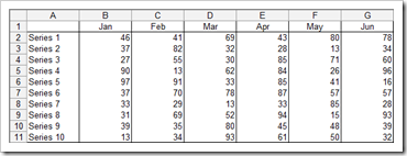
Let's assume we have a small data table with 10 rows and 6 months of data:
-
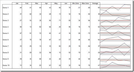
We now want to create a sparkline chart for every row of this table, including a horizontal line showing the average, dots for the minimum and maximum value and a shaded background for a defined range. Here is what you have to do:
-
Add 3 columns (H, I, J) to the table for the minimum and maximum value of the shaded background and for the average of every row.
-
Fill the new columns with data and the function AVERAGE.
-
Increase the height of the 10 rows and the width of column K.
-
Select cell K2 and type in the following function:
=LineChart(B2:G2,,,,J2,H2,I2,1) -
Copy down the function in cell K2 to the range K3:K11.
Here is the result:
-
If you have installed the add-in, you can also use the menu or toolbar to create your sparklines; again more or less exactly in the same way as you are using Excel’s menus and toolbars.
That's it.
To be crystal clear: You don't have to understand or even change the VBA code of Sparklines for XL. All you have to do is to download Sparklines for XL (again: it is free!) and the manual, to look up the names and the syntax of the UDFs and to use the UDFs on your worksheet wherever you need them.
You will find more detailed information about Sparklines for XL, the download links, the manual, examples, etc. on Fabrice's blog Sparklines for Excel.
Install the add-in or use the stand-alone workbook?
As mentioned above, Fabrice provides Sparklines for XL as a stand-alone workbook with VBA or as an Excel add-in for installation.
Each option comes with its advantages and disadvantages:
If you install the add-in, you do not have to worry about the VBA code being included in your workbook. The UDFs are always available in every workbook as long as the add-in is installed. This is an advantage and a disadvantage at the same time. If you hand over your workbook with sparklines to someone else who does not have the add-in installed on his computer, he will see ugly #NAME errors instead of the sparklines. Especially in corporate environments, the installation of add-ins is often difficult to manage or even not allowed. If you are using the workbooks with sparklines solely on your own computer, the add-in is the way to go. It is more convenient and you do not see the 'enable / disable macros dialog' when opening the file (unless you have some other VBA routines in your workbook).
If you want to distribute or publish your work, I recommend a stand-alone workbook. The other users have to enable macros when opening the file, but this is easier to explain, easier to understand and easier to use than requiring the installation of an add-in. The disadvantages of a stand-alone version are a significantly increased file size (caused by the VBA code in your workbook) and the requirement that you always have to make sure that the VBA code is included in the workbook.
If I may express a wish regarding the further development of Sparklines for XL, I would love to have an option that allows me to have the add-in installed and to copy the VBA code of selected chart types (i.e. the ones I need in my model) directly to the workbook. Exactly the feature John Walkenbach provides in his excellent Power Utility Pak for UDFs: John's PuP enables you to select one or several functions from the 'PuP Worksheet Function Library' and to copy the VBA code directly into your workbook. You need to have the PuP add-in installed to integrate these functions, but your workbook will be self standing afterwards, i.e. all selected UDFs are available and working, even if you are using the workbook on a computer without the PuP installed.
Paris is far away, but it seems as if I could already hear Fabrice saying something like
“Robert, it is open source and if you have an idea of how to improve, go and implement it.”
And of course he is right. But compared to Fabrice and Nixnut I am a lousy VBA developer. Though, if I will have some time on my hands during the next months, I think I will give it a try and do my best.
Sparklines for XL or standard Excel charts?
You may ask:
“Are there general guidelines when to use the standard Excel charts and when to use Sparklines for XL?”
Unfortunately no. It always depends on the requirements of your model, the way you want to visualize the data, the needs for quantitative precision as well as on the size and layout of your dashboard.
No general rules, but here are a couple of indications and hints:
-
If you need quantitative precision on your chart (axes and axes scales, data labeling, etc.), don't use sparklines. Use a standard Excel chart instead.
-
The more charts of one type you need on your dashboard, the more advantage you will take of sparklines. If you only have one or 2 line charts, use Excel's chart engine.
-
Small charts within data tables (one or several charts per row) is the perfect use case for sparklines. Creating, formatting, resizing and positioning 10 or 20 tiny Excel standard charts is truly an annoying procedure.
-
If you are extremely short of real estate on your dashboard, sparklines are always well worth a try, provided that the loss of quantitative precision is not a problem.
-
You can produce most of the sparkline chart types of Sparklines for XL using and tweaking the Excel chart engine as well. Bullet graphs, line charts with shaded backgrounds and min-max-tags, etc. are also possible with a tweaked Excel standard chart. But the process is much more complicated and you need advanced Excel chartings skills. Your call.
-
Some chart types of Sparklines for XL, however, are not possible with plain old Excel, i.e. without using VBA. If you want to have a 3D heatmap, for instance, Sparklines for XL is an easy way to do this.
My conclusion
Sparklines for XL are an excellent and cost-free implementation of sparklines. They are easy to understand and easy to use. From my point of view, with Sparklines for XL, Fabrice and Nixnut filled a gap in Excel's chart engine. One gap – among others - Microsoft was not able or willing to fill with Excel 2007.
Nevertheless I strongly recommend to always carefully consider whether or not sparklines are the best choice for your purposes. Sparklines are a great concept, but only in a context where they are appropriate. Sometimes they are the best way to visualize your data, sometimes a simple Excel standard chart will be sufficient and sometimes sparklines are definitely the wrong choice (e.g. if you need quantitative precision). Don't use them just for the sake of having them.
This is where it comes to full circle: my conclusion is just another quote from another Bruce Springsteen song:
“Don't try for a homerun, if you can get the job done with a hit.”
What's next?
This was my first post dedicated to Fabrice's Sparklines for XL.
Next week’s post will describe a real life showcase for sparklines on a professional dashboard, including the workbook for free download: a Model for Competitive Price Benchmarking of Mobile Phones.
Stay tuned.


Leave a Reply