Category: Visualization

  • Pivot-like Marimekko Charts in Excel

    How to create an interactive “Pivot-like” Marimekko Chart in Excel allowing the user to select the visualized dimensions and measure on the fly

    Rubik's Cube - Photographer: Clemens Koppensteiner (flickr.com)The previous post Marimekko Charts in Microsoft Excel described and provided a VBA-based template to create a Marimekko chart in Excel made up of freeform textboxes. In the article I claimed, the used approach would offer some flexibility. Action speaks louder than words, so let’s turn this rhetoric into action.

    A Marimekko chart visualizes one measure (numerical) by two dimensions (categorical). The original template provided in the previous post was based on a data source arranged in a crosstab.

    Now let’s say you have a data source with several dimensions and measures organized in a flat table. That’s the norm, isn’t it? If you want to quickly analyze this data in Excel, you will probably use a Pivot Table and maybe a Pivot Chart allowing you to easily select which dimensions shall go to rows and columns and which measure shall be summarized in the values area. Now this is exactly the feature we want to bring to our Marimekko chart template.

    Today’s post describes how to enhance the existing template with interactive features to enable the user to easily define what shall be displayed in the Marimekko chart. As always, the article includes the Microsoft Excel workbook for free download.

    (more…)

  • Marimekko Charts in Microsoft Excel

    A VBA based Microsoft Excel Template to create a Marimekko Chart aka Matrix Chart aka Mosaic Chart for free download

    marimekko #2 - Photographer: 4WheelsofLux (flickr.com)A Marimekko or Matrix or Mosaic Chart (called Marimekko hereafter) is a combination of a 100% stacked column chart and a 100% stacked bar chart combined in one view. It works like a 100% stacked column chart, but additionally the width of a column is proportional to the total value of this column.

    Microsoft Excel does not provide a built-in chart type for Marimekko charts, but there are several workarounds available to accomplish this. For instance, Jon Peltier shows in his article Marimekko Charts how to turn a combination of a stacked area and a line chart into a Marimekko chart. My friend Chandoo, Conditional Formatting aficionado he is, uses the cell grid, formulas and cell value based formatting rules to create a pseudo Marimekko chart in his post Market Segmentation Charts using Conditional Formatting. Of course there are also a couple of other blog posts on this topic and also commercial Add-ins available.

    Although Jon’s and Chandoo’s solutions work well and are available for a long time already, I decided to add my 2 cents with another approach: a VBA based solution creating a Marimekko chart made up of freeform text boxes. The main advantage: reduced set-up time and more flexibility, if the number of rows and columns of the Marimekko chart changes.

    Today’s article provides a VBA based solution to create a Marimekko chart in Microsoft Excel and explains how to use and customize the template to suit your requirements. As always, the workbook is available for free download and the VBA code is without password protection.

    (more…)

  • Bruce Springsteen Discography in Excel

    A Microsoft Excel Replica of the Tableau Infographic on Bruce Springsteen’s Discography

    Bruce Springsteen at the Austin Music Awards - Photographer: Charlie Llewellin (flickr.com)The recent post presented a Tableau Infographic on the Discography of Bruce Springsteen’s Studio Albums.

    Tableau apparently liked my Infographic and selected it as the Viz of the Day for June 25, 2013 and even incorporated it in the Tableau Public Gallery. I am feeling honored. Thanks, folks!

    I originally planned to directly continue with a follow-up post about how to create and when to use Word Clouds in Tableau.

    On second thought I decided to postpone this follow-up article. I haven’t published anything for more than 6 months and I had a strong feeling I should quickly do something for those of you primarily interested in Microsoft Excel.

    So, if you are waiting for the article on Word Clouds in Tableau, please bear with me. The post will come soon.

    Those of you interested in Excel: this is for you. What would have been more obvious than publishing a replica of the Bruce Springsteen Discography in Microsoft Excel? It goes without saying that the Excel workbook mimics the most interesting interactive features of the Tableau original. As always the article provides the Excel workbook for free download.

    (more…)

  • Bruce Springsteen Discography – An Infographic

    A Tableau Infographic – The Discography of Bruce Springsteen’s Studio Albums

    Bruce Springsteen live in Munich 2009 - Photographer: Lord_Henry (flickr.com)After six months without any new blog posts (please accept my apologies) I felt totally out of practice. Hence, I thought starting with a fun post and an infographic would make my comeback to blogging easier than an article on a more serious data analysis or data visualization topic.

    4 weeks ago I received an email from a guy (pen name: Chorizo Garbanzo) who runs together with 2 friends a music blog and podcast called Trust The Wizards.

    Chorizo stumbled across a post I have written back in November 2010: Wordle Tag Clouds in Microsoft Excel, where I used the lyrics of Bruce Springsteen songs to demonstrate how to embed Wordle in a Microsoft Excel workbook. Chorizo took the lyrics out of this workbook and created a blog post showing screenshots of Wordle Clouds for a selection of Springsteen albums: Trust The Wizards – Bruce Springsteen Lyric Art.

    Chorizo’s post and the fact that Tableau Software included Word Clouds in version 8 gave me the idea for today’s article: I completed the lyrics in my Excel workbook, added some additional information on the albums and created an interactive infographic on Bruce Springsteen’s Discography (studio albums only) in Tableau 8.

    (more…)

  • Build Network Graphs in Tableau

    Visualize Relationships, Connections and Associations in Networks with Tableau Software

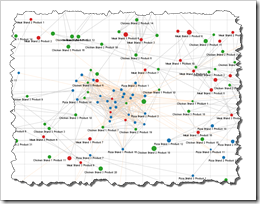
    Network Graph TableauClearly and Simply proudly presents a new guest article: Michael Martin of Business Information Arts, Tableau Partner, Tableau Certified Consultant and leader of the Toronto Tableau User Group shows us how to visualize Network Graphs using Tableau Software. Enjoy.

    Network Graphs can help us see and measure relationships and connections between people, places, and things over time. This can be expressed as identifying, measuring and understanding process flows, the mix of products in shopping carts, social network and email traffic, affinities and interests people share (or don’t share), and the “hierarchies of influence” in business and / or social systems by identifying who or what triggers events, and the impacts they have on others.

    Today’s post describes how you can build Network Graphs using Tableau Software versions 6 or 7, including a detailed how-to tutorial and some information on the background of Network Theory.

    (more…)