Category: Visualization

  • Cartograms in Microsoft Excel

    How to create Cartograms in Microsoft Excel
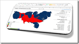
    Cartograms in ExcelThe article Cartograms in Tableau described the limitations of Choropleth Maps under certain circumstances and why Cartograms can sometimes be a viable alternative to color coded maps.

    Building upon that, the previous post (Create your own Cartograms in Tableau) provided a Microsoft Excel tool to create the polygons for Cartograms based on your own data. The Excel tool (called Cartogram Data Generator) is based on my VBA implementation of “an algorithm to construct continuous area cartograms” by J. Dougenik, N. Chrisman and D. Niemeyer, published in “Professional Geographer” back in 1985.

    With this VBA algorithm and two other techniques previously published here (Faster Choropleth Maps with Microsoft Excel and Create Excel Freeform Shapes from Polygons), we have all modules available to calculate and plot Cartograms directly in a stand-alone Microsoft Excel workbook.

    Today’s post describes how to create Cartograms in Microsoft Excel and provides two versions of the Cartogram workbook for free download.
    (more…)

  • US Public Holidays in Tableau

    Calculated Fields in Tableau for US Public Holidays

    Calendar Round - Photographer: vbecker (flickr.com)For the analysis of daily data, the weekday can be an important and helpful additional information.

    For instance: if you are analyzing sales or order figures, incoming calls in a call center, internet usage, web statistics or the like, you will probably see significant differences in the data between working days, weekends and public holidays.

    Your views and dashboards should enable the reader to immediately distinguish between the three types, e.g. by color coding. This is pretty easy to do for the weekends, but it takes some additional efforts to include the public holidays, too.

    Today’s post explains why color coding daily data by the type of the day can be important for analysis and visualization. The article provides and describes Calculated Fields in Tableau for all US public holidays and put them to use in a Tableau Public dashboard showing an interactive calendar with all public holidays in the US between 1900 and 2099.

    (more…)

  • Selecting and Highlighting Areas on Excel Charts

    Interactive Selecting and Highlighting Areas on an Map or an XY Scatter Chart in Microsoft Excel

    Selecting and Highlighting on Excel ChartsThe previous post demonstrated an alternative technique to implement a direct interaction with an Excel chart using an ActiveX label control sitting on top of the chart. The example used in that post (a geography quiz) allowed a click on a map and evaluated the coordinates of the position the user clicked on.

    The technique, however, can also be used in many more cases. If you are working with an XY scatter chart and especially if you are working with a map, interactive selecting and highlighting a user-defined area of the chart can be a very helpful feature for exploring and analyzing the data.

    Tableau Software, for one, allows for different ways of selecting and highlighting areas. Microsoft Excel has no such features built in. With the technique described in the previous post and some additional VBA code, however, you can bluff almost the same functionality in Excel.

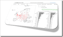
    Today’s article describes how to implement selecting and highlighting features on Excel charts. As always the example workbook and the VBA code is provided for free download.

    (more…)

  • Another Technique for Interactive Excel Charts

    Another technique to create interactive charts in Microsoft Excel using an ActiveX Label Control on top of the chart

    Where is it?Interactive features add a lot of analytical power to dashboards. If you want to create a professional analysis dashboard, interactivity is almost a must-have.
    Unfortunately, Excel does not provide built-in interactive features for charts. However, this doesn’t mean you can’t have interactivity on Excel dashboards.

    As always, VBA is the way to overcome Excel’s shortcomings.

    We already had a couple of articles providing workbooks with interactive features, like Bluffing Tableau Actions with Microsoft Excel, The Next Level of Interactive Microsoft Excel Dashboards, Microsoft Excel Site Catchment Analysis, Better Chart Tooltips with Microsoft Excel 2010.

    All of them were taking advantage of the chart object’s mouse event procedures. More precisely, they were based on the great code provided by Jon Peltier here: Get XY on any Chart.

    I recently discovered another technique to implement interactivity on Excel charts. Andy Pope uses an ActiveX label control on top of a chart to track and evaluate mouse positions. Unlike the chart object mouse events, Andy’s approach doesn’t require to activate the chart first.

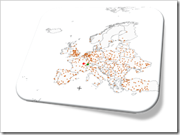
    I “stole” Andy’s idea and used his technique to create a little interactive geography quiz in Excel: find European cities on a map. Today’s article describes the implementation of the workbook and the code and – as always – provides the Excel file for free download.

    (more…)

  • Cartograms in Tableau

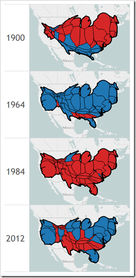
    Plotting preprocessed polygon data as Cartograms in Tableau: the results of the US Presidential Elections since 1900

    Cartograms of the US Presidential Elections plotted in TableauChoropleth Maps or Filled Maps (as they are called in Tableau) are a great technique for analyzing geographical data, especially for maps with a high level of detail (e.g. US by counties or ZIP codes). They make it very easy to identify geographical hot spots first and then drill down into these regions using other visualization types.

    Having said that, they also have their limitations and disadvantages. Even worse, under certain circumstances Choropleth Maps can be misleading and visualize the data incorrectly.

    A classic example of misleading Choropleth Maps are the well known US Presidential Election Maps. We all have seen them, right? A map of the USA with color coded states: a red fill color if the Republican candidate won the state and a blue fill color if the Democratic candidate won (and in some years other colors for independent candidates).

    Although these maps correctly depict the geographical distribution of “who won where”, they are usually telling the wrong overall story.

    How come?

    Traditionally Republicans very often win some of the larger states with a small population density like Alaska, Montana and Wyoming (and thereby only a small number of electoral votes). As a consequence red often dominates the color coding of the map, even if the Democratic candidate won the entire election.

    Cartograms are a geographical visualization on a map avoiding this problem. Cartograms are distorting the map by resizing its regions according to e.g. the population, the popular votes or the electoral votes, At the same time the Cartogram algorithm tries to retain the topology of the map as far as possible.

    Today’s article presents a dashboard on Tableau Public comparing a Filled Map with a Cartogram for every US Presidential Election since 1900.

    (more…)