Category: Visualization

  • Fast Choropleth Map with Enhanced Features

    Enhance a detailed Choropleth Map in Microsoft Excel with additional features
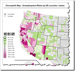
    Choropleth Map with enhanced featuresThe recent article Faster Choropleth Maps with Microsoft Excel provided a faster version of the VBA code to update a detailed Choropleth Map in Microsoft Excel.

    Leonid Koyfman, a faithful reader of Clearly and Simply liked this article. Leonid already contributed his invaluable ideas and insights here before (Excel Multiple Value Filters with Invert Selection). He had a couple of very interesting ideas for the fast Choropleth Map and he is kind enough to share them with us:


    1. Let the user filter the data by value bin and thereby highlight the bins of interest on the map
    2. Show tooltips when hovering over the map to display the name of the county and the unemployment rate in percent
    3. Let the user switch the level of detail: color the map by county or by state

    Today’s article describes Leonid’s enhancements and includes a link to the Excel workbook for free download.

    (more…)

  • Faster Choropleth Maps with Microsoft Excel

    An improved version of a Microsoft Excel Choropleth Map with a better performance for detailed maps

    Choropleth Map US Unemployment by CountyVery soon after starting this blog in 2009 I published a post with a set of Microsoft Excel Choropleth Map templates.  This post is still one of the most popular articles and downloads here.
    A lot of related posts followed and I am feeling very honored that my blogging colleague and France’s data visualization guru Bernard Lebelle of Impact Visuel used 2 of my maps published here on Clearly and Simply in his great new book “Convaincre avec des graphiques efficaces”. Bernard was kind enough to point his readers to my blog in the book. This is much appreciated. However, he should have heaped the praise on Tushar Mehta, who invented this technique. I only “stole” Tushar’s idea.

    Tushar’s approach works great and I know from comments and emails that a lot of my readers have used it with great success.

    There is only one minor drawback with Tushar’s approach: the performance decreases considerably when using it on a map with a lot of shapes, like the US by Counties.

    Today’s post tries to heal this. It discusses how to considerably improve the performance of a detailed map. The article describes the original approach, the optimization potential, the improved implementation and – as always – provides the Excel workbook for free download.

    (more…)

  • Dice Portraits of the Tableau Management

    Mosaic Dice Portraits of Tableau Software’s Leadership Team

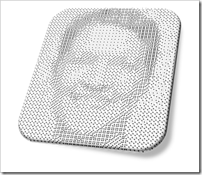
    Dice Portrait of Christian ChabotFirst things first: this is a fun post. Don’t expect to learn much from today’s article, neither about Data Visualization in general nor about special tips and tricks in Tableau.Today’s post is in line with 2 fun articles about (re-)creating art with Tableau Software:

    Tableau Replica of Curtis Steiner’s 1,000 Blocks

    and

    6 Famous Paintings in Tableau

    The article is adopting an idea of creating images using different faces of a dice: mosaic dice pictures or portraits. The post includes the beautiful article and video I stole this idea from and my Tableau workbook showing the portraits of the members of the Tableau Management Team using dice face custom shapes.

    (more…)

  • Taking up the SAP BO Dashboards Challenge

    Tableau vs. SAP BO Dashboards (powered by Graphomate) – a Tableau version of Lars Schubert’s Facebook Dashboard

    Sumo / Photographer: davidgsteadman (flickr.com)A couple of weeks back, my Tableau blogging colleague Ben Jones had two excellent posts over at Data Remixed on how to create a waterfall chart with Tableau: A Facebook Waterfall and How to Create a Tableau Waterfall Chart.

    Ben used the Facebook financials to demonstrate the technique.

    Lars Schubert, an outstanding SAP and data visualization expert (no, this is not an oxymoron, at least not in all cases), stumbled across Ben’s visualization and developed a couple of excellent ideas how to improve it. He completely revamped the dashboard using SAP Business Objects Dashboards (formerly known as Xcelsius) empowered by his own add–on called Graphomate. Earlier this week Lars published his version on the Graphomate company blog (the blog is in German).

    So far, so good. However, Lars decided to use a pretty provoking title for his article: Xcelsius vs. Tableau. Being the Tableau aficionado I am and – to my knowledge – the only German native speaker blogging about Tableau so far, I felt the ball being in my court.

    With today’s post I am taking up the challenge: the article discusses Lars’ great ideas for improvement (including his dashboard) and my answer to it using Tableau Software.

    (more…)

  • 6 Famous Paintings in Tableau

    Visualize 6 world famous paintings with Tableau Software

    © Songkran / flickr.comIt has been a very long time since the last post here on Clearly and Simply: the start of a guest post series by Sheel Bhatiani about how to Expand your reach in Tableau with Parameters.

    Ever since I was so snowed under with work that I wasn’t able to do the final editing and formatting of Sheel’s articles. I hope for your understanding.

    I know that most of you are eagerly waiting for the guest series to be continued. Agreed, it is long overdue, but please bear with me, I can’t let this one go: Yesterday the Art Newspaper published that the earliest copy of the Mona Lisa has been found at the Prado in Madrid, Spain. Today, Darren Chalk over at The Data Studio published the first article of a series of posts about Art in Tableau.

    This reminded me of publicly available data sets to visualize famous paintings like van Gogh’s Self Portrait, Botticelli's The Birth of Venus and – you guessed it – Leonardo da Vinci's Mona Lisa.

    Way back in June 2010, I already published an emulation of a piece of art using Tableau: The Tableau Replica of Curtis Steiner’s 1,000 Blocks and – although totally useless for business applications – that post was very well received by my readers.

    Thus, I just can’t let this opportunity slip through my fingers and I intersperse this little article before we will continue with Sheel’s next article.

    (more…)