Category: Tableau

  • Extract Custom Shapes from a Tableau Workbook

    How to extract the Custom Shape Images embedded in a Tableau Workbook

    Enigma Inside - Photographer: Anthony Catalano (flickr.com)In Tableau Software you can use the Shape Mark property to encode data in a view by different shapes. You can either use Tableau’s default shapes (circles, squares, crosses, etc.) or so called Custom Shapes. Each Tableau installation comes with a set of Custom Shape palettes like arrows, bars, currency and gender symbols and others. Have a look into the Shapes folder of your Tableau Repository to see what is already there.

    On top of that, you can also add your own Custom Shape Palette to this collection. Simply create a new folder in the Shapes folder of your Tableau Repository and copy the image files you want to use as shapes (.png, .gif, .jpg, .bmp or.tiff, but no .emf) into this folder. If you then assign shapes in the Edit Shape dialogue in Tableau, this folder automatically appears in the Select Shape Palette drop down and your images can be used to encode the data.

    Tableau stores the used Custom Shapes in the .twb file, to make sure the workbook is fully functional on every computer, i.e. also on installations which do not have the Custom Shapes in the Tableau Repository.

    So much for the background. And so far, so good.

    Now, imagine you have a Tableau workbook using Custom Shapes, but you do not have the image files in your Tableau Repository, because you are working with a new or different computer, you received the workbook from a colleague or downloaded it from Tableau Public.

    What if you want to reuse the Custom Shapes in another workbook?

    Is there an option to extract the Custom Shape image files from a Tableau workbook?

    Not built-in, but there are two existing workarounds provided by Matt York in the Tableau Forum and on the Tableau Public Blog. Although Matt’s solutions are very smart and easy to use, I decided to add my 2 cents with a third workaround.

    Today’s post includes the links to Matt York’s Tableau Shape Extractor workarounds and describes a third option of how to do the same with a Microsoft Excel workbook. As always, the article provides the Extract Custom Shape Excel tool for free download.

    (more…)

  • Bruce Springsteen Discography – An Infographic

    A Tableau Infographic – The Discography of Bruce Springsteen’s Studio Albums

    Bruce Springsteen live in Munich 2009 - Photographer: Lord_Henry (flickr.com)After six months without any new blog posts (please accept my apologies) I felt totally out of practice. Hence, I thought starting with a fun post and an infographic would make my comeback to blogging easier than an article on a more serious data analysis or data visualization topic.

    4 weeks ago I received an email from a guy (pen name: Chorizo Garbanzo) who runs together with 2 friends a music blog and podcast called Trust The Wizards.

    Chorizo stumbled across a post I have written back in November 2010: Wordle Tag Clouds in Microsoft Excel, where I used the lyrics of Bruce Springsteen songs to demonstrate how to embed Wordle in a Microsoft Excel workbook. Chorizo took the lyrics out of this workbook and created a blog post showing screenshots of Wordle Clouds for a selection of Springsteen albums: Trust The Wizards – Bruce Springsteen Lyric Art.

    Chorizo’s post and the fact that Tableau Software included Word Clouds in version 8 gave me the idea for today’s article: I completed the lyrics in my Excel workbook, added some additional information on the albums and created an interactive infographic on Bruce Springsteen’s Discography (studio albums only) in Tableau 8.

    (more…)

  • Build Network Graphs in Tableau

    Visualize Relationships, Connections and Associations in Networks with Tableau Software

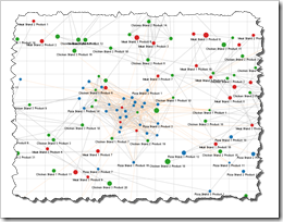
    Network Graph TableauClearly and Simply proudly presents a new guest article: Michael Martin of Business Information Arts, Tableau Partner, Tableau Certified Consultant and leader of the Toronto Tableau User Group shows us how to visualize Network Graphs using Tableau Software. Enjoy.

    Network Graphs can help us see and measure relationships and connections between people, places, and things over time. This can be expressed as identifying, measuring and understanding process flows, the mix of products in shopping carts, social network and email traffic, affinities and interests people share (or don’t share), and the “hierarchies of influence” in business and / or social systems by identifying who or what triggers events, and the impacts they have on others.

    Today’s post describes how you can build Network Graphs using Tableau Software versions 6 or 7, including a detailed how-to tutorial and some information on the background of Network Theory.

    (more…)

  • Tableau Quick Tip #4 – Drop Lines

    Call out positions of selected data points in your Tableau view using Drop Lines

    Ruler Macro - Photographer 2nd_Order_Effect (flickr.com)

    I am barely
    using gridlines on my charts. In fact I didn’t even know that Tableau Software has an option to show and format gridlines. Hence I
    started the original introduction to this post as follows:

    Unlike Microsoft
    Excel,
    Tableau Software does not provide an option to display gridlines on
    charts. Tableau allows you to define so called row and column dividers, but
    only for categorical data, i.e. dimensions.

    This statement
    is totally wrong: Tableau offers gridlines (Format | Lines | Grid Lines) and
    Rich was kind enough to correct this in the first comment to this post. Thanks
    Rich. My fault. I apologize for the confusion.

    But still:
    gridlines are very often nothing else than chart junk as Stephen Few points out
    in this excellent article: Grid Lines in Graphs are Rarely
    Useful
    . Tableau has something way
    more useful than gridlines: the interactive Drop Line.

    Today’s short Tableau Quick Tip #4 introduces this extremely helpful interactive feature of Tableau.

    (more…)

  • O’zapft is!

    The Development of the Beer Prices at the Oktoberfest – a Tableau Visualization and Analysis

    Oktoberfest Impressionen - Photographer: sanfamedia.com (flickr.com)At this moment Munich’s mayor Christian Ude opens the 179th Oktoberfest in Munich with the traditional shout “O’zapft is” after tapping the first barrel of beer.

    Prior to every Oktoberfest we have a reoccurring heated discussion on the beer price. And – except for the breweries and the tent hosts – we all agree that this year’s “drastic” rise of the beer price is inacceptable.

    No one really takes this discussion too seriously, but we are having it every year.

    So, today’s opening of the Oktoberfest is a good opportunity to have a closer look at the prices and the price development of beer at the Oktoberfest. This article provides an interactive Tableau visualization (beer prices since 2002), followed by an analysis of the price trend since 1952.

    (more…)