Category: Tableau

  • Writing and Reading Tableau Views to and from Databases and Text Files – Part 1

    How to use R, a Tableau connection to R and Calculated Fields to store and load the underlying data of a defined Tableau View in a Database or Text File (part 1 of 2)

    R - Photographer: Karyn Christner (flickr.com)My good friend Michael Martin is kind enough to contribute another guest post to Clearly and Simply.

    Michael is the Managing Partner at Business Information Arts, Inc, Tableau Partner, Tableau Certified Consultant, Tableau Instructor, leader of the Toronto Tableau User Group and – as Interworks calls him for very good reason – a Tableau Maestro.

    In his article, Michael will show us how to store the underlying data of Tableau Views in a database or a text file using R and Tableau Calculated Fields. Michael's post will come in 2 installments.

    NOTE: It may be necessary to zoom in on some of the graphics within the body of the text below for better legibility.  If you are running 32 bit Microsoft Access under 64 bit Windows, and wish to output the data in a Tableau view to 32 bit Microsoft Access, please read the Appendix to this post before proceeding. Supporting files and a README file are available for download at the end of the second part of the post. Please look at the README file first.

    The author would like to thank Leonid Koyfman for his suggestions.

    Here is part one:

    In the Bar Graph View below (based on the Superstore dataset that comes with Tableau), yearly sales are summed and colored by profit and sized by discount:
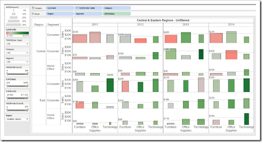
    Superstore View

    Reference lines show average sales within each region and customer segment by year for all categories.

    How can we “capture” the data in this view and save it in a database for further analysis and re-use?

    Tableau does let you view underlying data and copy it to the clipboard, export it to a text file, or even a Microsoft Access database, but these are manual operations. What if you could write a Tableau Calculated Field to export the underlying data in a Tableau View to any Database Server that supports the ODBC protocol?

    You can, using R, and an R language library called RODBC.

    Tableau opened the door to using R language libraries within Calculated Fields in version 8.1. This article walks you through downloading and installing R on a desktop computer, configuring Tableau to use your R installation, and writing the Calculated Fields required to export data from a Tableau view to a database such as SQL Server or Microsoft Access.
    (more…)

  • Create your own Cartograms in Tableau

    The Cartogram Data Generator: a free Excel Tool to create your own polygon data for plotting Cartograms in Tableau

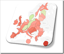
    Cartogram EUOne of the recent posts showed how Cartograms can be a viable alternative when Choropleth or Filled Maps are stretched to their limits and tell the wrong overall story:

    Cartograms in Tableau

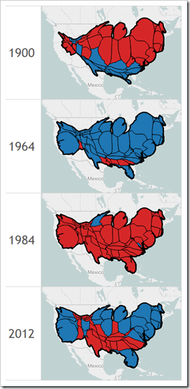
    The article included a Tableau Public dashboard comparing Filled Maps with Cartograms for the results of the US Presidential Elections since 1900.

    Since Tableau does not provide Cartograms as a built-in chart type, the distorted polygons have to be calculated outside of Tableau and then used as a data source to plot the maps using Tableau’s polygon map approach.

    Today’s article is the follow-up post. It provides a free and open Microsoft Excel workbook to create Cartogram data with a few mouse clicks: copy in the data and the original polygon points of all regions and let the tool create a ready-to-use data set to plot Cartograms in Tableau.

    (more…)

  • German Public Holidays in Tableau

    Calculated Fields in Tableau for German Public Holidays

    abgerissen - Photographer:  Literaturarchiv Saar-Lor-Lux-Elsass (flickr.com)The previous post explained why color coding public holidays can be very effective for analyzing daily data, provided the Calculated Fields for all public holidays in the United States and included an interactive calendar for the US on Tableau Public.

    The Calculated Fields for the US public holidays are pretty straight forward and not too complicated.

    This can be different in other countries. And it sure is in my homeland. In Germany, all variable public holidays depend on Easter Sunday. And, if you read on, you will see that Easter Sunday requires a really complex calculation.

    Today’s post provides the Calculated Fields for all German public holidays and a German version of the interactive calendar on Tableau Public.

    (more…)

  • US Public Holidays in Tableau

    Calculated Fields in Tableau for US Public Holidays

    Calendar Round - Photographer: vbecker (flickr.com)For the analysis of daily data, the weekday can be an important and helpful additional information.

    For instance: if you are analyzing sales or order figures, incoming calls in a call center, internet usage, web statistics or the like, you will probably see significant differences in the data between working days, weekends and public holidays.

    Your views and dashboards should enable the reader to immediately distinguish between the three types, e.g. by color coding. This is pretty easy to do for the weekends, but it takes some additional efforts to include the public holidays, too.

    Today’s post explains why color coding daily data by the type of the day can be important for analysis and visualization. The article provides and describes Calculated Fields in Tableau for all US public holidays and put them to use in a Tableau Public dashboard showing an interactive calendar with all public holidays in the US between 1900 and 2099.

    (more…)

  • Cartograms in Tableau

    Plotting preprocessed polygon data as Cartograms in Tableau: the results of the US Presidential Elections since 1900

    Cartograms of the US Presidential Elections plotted in TableauChoropleth Maps or Filled Maps (as they are called in Tableau) are a great technique for analyzing geographical data, especially for maps with a high level of detail (e.g. US by counties or ZIP codes). They make it very easy to identify geographical hot spots first and then drill down into these regions using other visualization types.

    Having said that, they also have their limitations and disadvantages. Even worse, under certain circumstances Choropleth Maps can be misleading and visualize the data incorrectly.

    A classic example of misleading Choropleth Maps are the well known US Presidential Election Maps. We all have seen them, right? A map of the USA with color coded states: a red fill color if the Republican candidate won the state and a blue fill color if the Democratic candidate won (and in some years other colors for independent candidates).

    Although these maps correctly depict the geographical distribution of “who won where”, they are usually telling the wrong overall story.

    How come?

    Traditionally Republicans very often win some of the larger states with a small population density like Alaska, Montana and Wyoming (and thereby only a small number of electoral votes). As a consequence red often dominates the color coding of the map, even if the Democratic candidate won the entire election.

    Cartograms are a geographical visualization on a map avoiding this problem. Cartograms are distorting the map by resizing its regions according to e.g. the population, the popular votes or the electoral votes, At the same time the Cartogram algorithm tries to retain the topology of the map as far as possible.

    Today’s article presents a dashboard on Tableau Public comparing a Filled Map with a Cartogram for every US Presidential Election since 1900.

    (more…)