Category: Show Cases

  • Microsoft Excel Site Catchment Analysis (Part 1)

    The Microsoft Excel version of the Site Catchment Analysis of Germany including the calculation of the optimal center
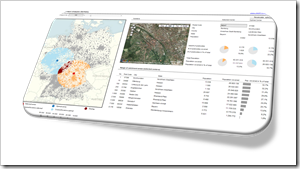
    Site Catchment Analysis DashboardIn October 2010 I used a show case of a site catchment analysis of Germany to demonstrate the power of Calculated Fields in Tableau. During the weeks that followed we had quite an avalanche of follow-up posts on this article: Site Catchment Analysis with Tableau 6 described an upgrade of the original workbook to the new version 6 of Tableau, including the roadblocks I hit during the upgrade. In a fantastic guest post series called “Another Look at Site Catchment Analysis with Tableau 6” (part 1, part 2, part 3), Richard Leeke showed how to overcome most of the disadvantages in my implementation.

    I suspect you may already be fed up with this example. Despite the risk of boring you, I decided to stay a little longer with this topic, mainly for the following 3 reasons:

    • The use case turned out to be a very interesting and yielding example for the discussion of features, techniques, workarounds and performance facets of Tableau Software. I guess everything has been said (especially by Richard) with regards to Tableau. But what about Microsoft Excel?
    • Furthermore, finding data points within a certain radius from a given center has many more use cases than just a site catchment analysis. You may analyze sales performance KPIs, customer behavior or logistical statistics within a certain area. I am convinced, a Microsoft Excel version of the site catchment analysis can be very useful for some of your analyses of geographical data.
    • Last, but not least, the Tableau implementation allowed to display the results of any user selected postcode, but it lacked a feature to calculate the optimal center of any given radius. A task tailored for Microsoft Excel.

    Thus, today’s article will provide a Microsoft Excel workbook to conduct a site catchment analysis and to compare the results of the optimum with any given center, including some nice interactive features on the dashboard. As always the Excel workbook is provided for free download.

    (more…)

  • Site Catchment Analysis with Tableau 6

    Use Parameters and Table Calculations in Tableau 6 for a Site Catchment Analysis of Germany

    © R.-B. / pixelio.deFor a recent post called Calculated Fields in Tableau I used a site catchment analysis of Germany to explain how to use and take advantage of Calculated Fields in Tableau. The example posted back then was produced with Tableau 5.2.

    The main disadvantage of that workbook is the fact that you have to change a constant in a Calculated Field if you want to switch to another center location for the site analysis. Inconvenient and even impossible if you only have the Tableau Reader available.

    With version 6, available since November 10, 2010, Tableau introduced an extremely powerful new feature: Parameters. Parameters are user-defined constants that can be used in Calculated Fields. They can be entered by the user of the workbook either on worksheets or dashboards, are valid throughout the whole workbook (e.g. they are global) and can be used in any Calculated Field. Thus, it wasn’t far to seek that with parameters Tableau 6 would easily overcome the main drawback of the Tableau 5 site analysis workbook.

    Today’s post shows how to transform the site analysis workbook to Tableau 6 using parameters. As usual including the Tableau Public workbook for direct access and free download.

    (more…)

  • Calculated Fields in Tableau

    How to create and use Calculated Fields in Tableau Software, illustrated with a show case of a site analysis for Germany

    © Kathrin Antrak / pixelio.de

    As soon as your data analyses and visualizations with Tableau Software become more complex, you will soon find that sometimes your data source does not include all the measures and dimensions you need.

    One of the most common examples is a data set including the measures revenues and costs, but lacking a profit field.

    This is where Tableau’s Calculated Fields come into play. This functionality enables you to add new fields based on dimensions and measures from your data source and/or based on other Calculated Fields.

    If you are interested in professional data analysis and visualizations using Tableau Software, you definitely won’t get out of using Calculated Fields sooner or later.

    Today’s post discusses the power of Tableau’s Calculated Fields, including a definition, a short how-to tutorial and a few additional tips. A show case of a site analysis for Germany illustrates the use of different types of Calculated Fields including the Tableau packaged workbook for free download. 

    (more…)

  • Combine Tables and Charts on Excel Dashboards

    Visualize Football League statistics on an Excel Dashboard integrating charts directly into a table

    Allianz Arena - Home of FC Bayern Munich - click to enlarge Combining tables and charts is a very powerful technique for creating Microsoft Excel dashboards. It allows you to integrate texts, values and visualizations into one table. This ensures to have the maximum of information at a glance, including a direct comparability row by row.

    I already used this technique in several posts before, like the Sparklines for XL showcase or the Software Project Dashboard examples. Today’s article provides another showcase for a dashboard combining tables and charts.

    Football rules the world, especially these days. We are all impatiently waiting for the FIFA World Cup in South Africa, aren’t we? My friend Chandoo recently had a very nice post on visualizing the different footballs used in the World Championships since 1930. That’s remarkable, because Chandoo lives in India and I suppose he is more interested in cricket than football. But as I said, football rules the world these days.

    That’s why it somehow suggests itself to use a football-related visualization for today’s post. But I will not go for the FIFA World Cups. Not yet. Today’s article shows how to visualize national football league statistics using a dashboard that combines tables and charts. As always including the Microsoft Excel workbook for free download.

    (more…)

  • Where the rubber meets the road

    A self organizing feature map for Travelling Salesman Problems implemented in Microsoft Excel

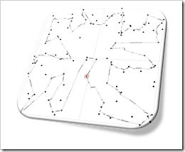
    Self organizing feature map for TSPs - click to enlargeIn the recent post we discussed the question whether Microsoft Excel is a viable platform for developing and testing models and algorithms for complex combinatorial optimization problems.

    The Travelling Salesman Problem (TSP) is probably one of the most popular challenges in combinatorial optimization and Operations Research. Why? I suppose because it is so easy to describe, but hard to solve.

    There are hundreds or even thousands of different algorithms (exact solutions or heuristics) for the basic TSP or its variants. One approach is a so called self organizing feature map also known as a Kohonen Map: an artificial neural network using unsupervised learning to solve combinatorial optimization problems.

    I selected this approach not only because I have done some studies on this topic back in the 1990s, but rather because both, the problem itself and the self organizing algorithm are very well fitting for an interesting visualization model that is fun to watch working.

    Today’s post describes such a self organizing feature map for Travelling Salesman Problems. I will not discuss the math in detail, but rather try to explain the approach itself, the algorithm’s mode of operation and the implementation with Microsoft Excel. As always, the result (i.e. the Microsoft Excel workbook) is provided for free download.

    (more…)