Category: Microsoft Excel

  • S-Shaped Function in Microsoft Excel

    A ready-to-use template for an S-shaped Function in Excel
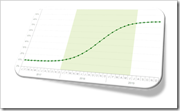
    S-shaped function ExcelThe previous post S-Shaped Function in Tableau discussed and provided the implementation of a customizable, i.e. user-defined S-shaped function in Tableau Software.

    In the introduction to this post I wrote: “Having a ready to use S-shaped function in Tableau is a must-have for your Advanced Analytics Toolbox.”

    This applies to Microsoft Excel, too. Maybe even more.

    There are quite a few different S-shaped functions in Excel available on the Internet. The first implementation I saw was a post by Juan C. Mendez back in 2007. Unfortunately Juan’s site is down now, but an archived version is still available here. Others built upon Juan’s approach, like Mathias over at Clear Lines Consulting and this site is still up.

    Juan and Mathias used a different formula than I do (in Tableau and in Excel), but the result is pretty much the same. The only new feature in my implementation is the option to highlight the period of fast growth of the S-shaped function with a reference band.

    So, nothing really new under the sun in this post, but – for the sake of completeness – here is my Microsoft Excel template of an S-shaped function for free download:

    Download S-shaped Function (Microsoft Excel 2007-2016 workbook, 26K)

    If you are interested in how to use the parameters to shape the curve, please refer to the previous post S-Shaped Function in Tableau.

    More things to come soon.

    Stay tuned.
  • User-defined Excel Chart Tooltips

    How to provide different options of customized tooltips on a Microsoft Excel chart and let the user decide which one to display

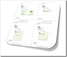
    User Defined Tooltips in Microsoft ExcelOne of the previous posts described four different techniques how to create customizable, meaningful tooltips on XY Scatter Charts in Microsoft Excel:
    Customizable Tooltips on Excel Charts

    Two of the approaches used a camera object (aka linked picture) to allow more formatting options of the tooltip.

    This idea can be taken one step further: with camera objects, you can easily provide more than one type of tooltip and let your user interactively select the tooltip which is most helpful for his analysis.

    Today’s article describes how to enable your user to select from five different tooltips with one single click: dimensions and measures, only a dimension and three additional charts displaying further information on the data point currently hovered over with the mouse. The post describes the idea and the implementation and of course makes the example workbooks available for free download.

    (more…)

  • List of all Files in a Folder and its Subfolders

    How to create a list of all filenames inside a specified folder and its subfolders including additional information like file types, sizes, dates and path lengths in Microsoft Excel

    List of all filenames in a folder and its subfolders - click to enlargeFrom time to time, I am taking the liberty to post something totally off topic (see here or here), i.e. something that has nothing to do with data analysis and data visualization.

    Today’s short article belongs to this category.

    A couple of weeks ago, I ran into a problem with my offline backup software. The application threw a few errors, reporting it could not backup a couple of my documents. The issue was easy to find: the path of those files exceeded the maximum path length of the Windows API (260 characters).

    It wasn’t so easy to fix, though, because the error log file of my backup software isn’t very helpful. I needed something to easily identify the files with a path length exceeding the 260 characters limitation, so I could shorten the folder and file names.

    Hence, I wrote a little tool which automatically creates a list of all files inside a specified folder and all its subfolders, including the file names, the paths, the file types, the dates (created, last modified, last accessed) and the lengths of the path and filename. This list sorted descending by path lengths made it easy to identify the files my backup software couldn’t handle.

    According to this Microsoft article in the Windows Developer Center, the maximum length limitation shall disappear in Windows 10, version 1607. The root cause for creating this workbook and code may go away soon, but I assume the little tool of easily getting a list of filenames inside a specified folder may be helpful on other occasions, too.

    If you are interested, here it is for free download:

    Download retrieve filenames from folder and subfolders (zipped Excel 2010 – 2016 workbook, 34.2K)

    Download, unzip and open the tool, enable macros, click on the import icon at the top of the sheet, select a folder and wait until the code is finished (the status bar at bottom left shows the progress).

    Please be advised that the code is not optimized for performance. Importing the ~41,000 files in my document folder took ~6 minutes on my machine. Not really fast, but since I am not doing this on a daily basis, it is good enough in my book.

    I hope this will be helpful for someone else, too.

    More posts on data analysis and visualization will come soon.

    Stay tuned.

  • Customizable Tooltips on Excel Charts

    How to create customizable, meaningful tooltips on XY Scatter Charts in Microsoft Excel

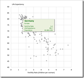
    Customizable Chart Tooltips on Excel XY Scatter ChartBack in December 2010, I published an article about Better Chart Tooltips with Microsoft Excel. The post described the weaknesses of Microsoft Excel’s standard chart tooltips and provided a VBA-based technique how to get to customizable, meaningful and more useful tooltips in Excel.
    Today, I would like to revisit this topic for several reasons:

    Firstly, Microsoft hasn’t done anything about this shortcoming in the versions 2013 and 2016. The problem of insufficient chart tooltips in Excel remains.

    Secondly, the workbook provided in 2010 implemented the better chart tooltips on another dashboard with additional features, which was published here: Bluffing Tableau Actions with Microsoft Excel. Many people have asked for a simplified, generic template only providing the tooltips on a standard XY Scatter chart.

    Next, reader Will Clark came up with the great idea of using a camera object instead of a simple textbox, in order to have more formatting options.

    Last, but not least, I discovered another approach for creating interactive charts in Excel. I already used and published this in several posts (Another Technique for Interactive Excel Charts, Selecting and Highlighting Areas on Excel Charts, Select Areas on a USA Map in Microsoft Excel and Zooming in and out of Excel Charts), but this technique is also viable for implementing chart tooltips.

    Today’s post will discuss again Excel’s shortcomings in terms of chart tooltips, briefly describe 4 different techniques how to overcome this issue and – as always – provide the Microsoft Excel workbooks for free download.

    (more…)

  • Zooming in and out of Excel Charts

    Interactive zooming in and out on Charts in Microsoft Excel

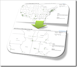
    Zoom in and out on Excel ChartsIf you have an XY scatter chart with a lot of data points in Microsoft Excel or even using an XY scatter chart mimicking a map in Excel, an interactive zooming function (allowing to magnify user-defined parts of the chart) can be very helpful.

    Microsoft Excel does not provide such a feature natively. There have been a few workarounds published. Most of them use interactive controls like spinners or sliders to change the axes scales with OFFSET formulas and dynamic cell ranges or by VBA.

    A more intuitive way of zooming into a chart would be to select an area on the chart with the mouse and zoom exactly into this user-defined part of the chart (or map).

    We recently had a couple of posts taking advantage of Andy Pope’s stellar idea to use a label control on top of a chart for interactive chart features:

    Another Technique for Interactive Excel Charts

    Selecting and Highlighting Areas on Excel Charts

    Select Areas on a USA Map in Microsoft Excel

    Andy’s technique is very versatile and can be a viable solution for many different use cases, including the requirement of an interactive zooming feature.

    Today’s post describes an implementation of an interactive zooming feature for a map (XY scatter chart) in Microsoft Excel. As always, the workbook is provided for free download.

    (more…)