Category: Microsoft Excel

  • Sparklines for XL – Chart Gallery

    An amendment to “You can't start a fire without a spark (1)” – The Chart Gallery for free download
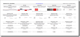
    Sparklines for XL Gallery - click to enlarge After I recently published the review of Fabrice Rimlinger’s Sparklines for XL, I received a couple of emails from readers asking me for the Excel workbook with the chart gallery. I haven’t thought of providing a download link to this file, because it is a pretty simple workbook, only putting together the most important chart types of Sparklines for XL on one sheet, using dummy data. No explanation of the syntax of the UDFs included, no real life examples and only a very brief description of the chart types. Its only purpose was to create a quick overview of Sparklines for XL.

    Fabrice provides much better and more detailed information on how to use Sparklines for XL with his manual and all the posts and examples on his blog.

    Anyway, if you think my chart gallery workbook would be helpful as well, here is the file for free download:

    The workbook is an Excel 2003 stand-alone file, i.e. the VBA code is included, no need for installing the add-in.

  • You can’t start a fire without a spark (1)

    A Review of Fabrice Rimlinger's Sparklines for XL

    sparkline Please don't be confused by the title of this post. This is not off topic. This post is not about the lyrics of a 25 year old Bruce Springsteen song. It is the first of two posts on using sparklines in professional Business Intelligence dashboards.
    There is more than one way to heat a map recently described – among other techniques – how to use Fabrice Rimlinger's brilliant open source Sparklines for XL to create a 2-dimensional tabular heat map with Microsoft Excel. Back then I announced that I will have one or two more posts dedicated to Sparklines for XL here on Clearly and Simply.

    This is the first one, a brief review of Sparklines for XL.

    (more…)

  • Visiting a friend

    Chandoo's KPI Dashboards revisited – the Box Plots

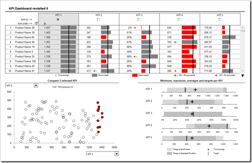
    In summer 2008 my friend and Microsoft Excel MVP Chandoo was kind enough to give me the opportunity of contributing guest posts to his excellent blog Chandoo.org. Actually Chandoo even featured a whole 6 post series on how to create interactive KPI dashboards with Microsoft Excel. Here is a screenshot of the final dashboard:

    PHD KPI Dashboard - click to enlarge


    The last part of the series was about box plots to visualize the distribution of the data (Box Plots Excel Dashboards Tutorial), including average and target values. At that time Chandoo and I decided to apply Occam’s razor and we restricted the tutorial to a simplified version of box plots, working only for data sets with positive values.

    This follow-up post on my own blog is about how to create these box plots for all kind of data distribution, i.e. positive and negative values.

    (more…)

  • There is more than one way to heat a map

    2D Tabular Heatmaps with Microsoft Excel

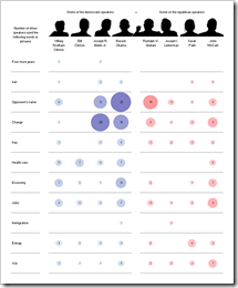
    NYT Speakers XL Replica - click to enlarge Inspired by a NY Times chart, Juice Analytics recently had a post and a discussion on bubble chart heat maps: Bubble, bubble toil and trouble. Chris Gemignani wrote:

    “The first tool we tried, simply on principle, was Excel 2003. As expected, making a NY Times quality bubble chart in Excel 2003 is a hard problem.”

    Juice Analytics is one of my favorite blogs on visualization and I learned a lot from the blog and website. But in this case I do not agree at all. And it seems as if I am not alone.

    What had to come, came. Some of us – including myself – could not let this rest.

    • I used Fabrice Rimlinger’s famous Sparklines for XL (free download here) and created a replica of the NY Times chart. Fabrice was kind enough to publish this on his blog (Yes, we can) and his own version with an improved visualization using bar charts (Stick to the classics?).
    • Two days later my friend and Excel MVP Chandoo showed Visualizing Search Terms on Travel Sites, a bubble-chart solution with plain old Excel (no VBA).
    • Last, but not least: Andreas Lipphardt of xlCubed was ahead of his times and had a post on creating heatmap tables with Excel based on bubble charts already in August 2008.

    Conclusion: Yes you can. It is not a hard problem to create quality heat maps with Microsoft Excel.

    But let’s take one step back. What if you don’t want to use the size of the bubbles for visualization? What if you want to create a classic heat map, i.e. the higher the value, the darker the fill color of the cell and vice versa? Following a definition like the one on Wikipedia:

    “A heat map is a graphical representation of data where the values taken by a variable in a two-dimensional map are represented as colors.”

    Can you create a classic 2-dimensional tabular heatmap with Microsoft Excel as well?

    Yes, you can. And there is more than one way to skin the cat. This post shows the different options and includes all examples for free download.

    (more…)

  • What is not on paper has not been said

    Monitor your project with an Action Point Register

    „Action point register? What is an action point register? A to-do-list?”

    Well, yes and no. Basically it is a to-do-list, however not for a single person but for a team or a project group. It helps the project manager to document, assign, schedule and track all action points and issues.

    „Alright, it is a longer to-do-list and distributed among the team members. Who needs another Excel template for a to-do-list?”

    I agree, it is really easy to create a simple to-do-list with Microsoft Excel within a couple of minutes and probably most of you have already done this. Even if you don’t want to create one, several websites and blogs are providing different free templates for to-do-lists / action point registers.

    So why publish another one? Well, because I think this one is a bit more sophisticated. And it is quite in line with the post on importing Microsoft Project files into Microsoft Excel.

    (more…)