Category: Microsoft Excel

  • Financial Modeling World Championships 2014

    Invitation to register for ModelOff’s Financial Modeling World Championships 2014

    A guest post by John Persico, Executive Director at ModelOff. As a lead organizer of the event, John invites you to take part in the 2014 Excel Modeling World Championships.ModelOff's Financial Modeling Word Championships 2014

    (more…)

  • Motion Chart Excel Template

    A generic template to create Motion Charts in Microsoft Excel and 2 examples to animate La Linea episodes in Excel

    La Linea #7 - Photographer: Jimmy Fllnk (flickr.com)A preliminary note

    In the previous article I published my three entries for Tableau’s current “Viz as Art” contest.

    With pride and humility I announce that one of my entries (my replica of Curtis Steiner’s 1,000 blocks) made the cut and is among the 10 finalists:

    Destination Data—Viz as Art contest finalists & voting

    The voting is open now through Friday, August 29, 2014, 5pm (PST) and takes place on Twitter. So, if you have a Twitter account, please have a look and vote with a tweet.

    To be crystal clear: I am not asking you to necessarily vote for my entry. Have a look, see for yourself and decide which entry you like most. It goes without saying that it is your decision who to vote for, but please do vote. Thank you!

    So much for the preliminary note, now on to today’s content:

    As mentioned above, I submitted three entries, but truth be told, I had a favorite child: the La Linea workbook. Maybe because it was the only one I haven’t published before, maybe because it reminds me of my childhood, I don’t know.

    Anyway. As soon as you have your data, it is very easy to create this animation in Tableau. However, this kind of motion chart is possible in Microsoft Excel, too. So I thought it might be interesting to publish an Excel replica of my La Linea Tableau workbook.

    Today’s post provides an Excel version of my La Linea Tableau workbook, a generic template to create motion charts in Excel and also an Excel workbook to animate a whole episode of La Linea. Of course, all workbooks are provided for free download.

    (more…)

  • Drill Up and Down on Choropleth Maps in Excel

    Interactive drill up and down geographical hierarchies on a Choropleth Map in Microsoft Excel

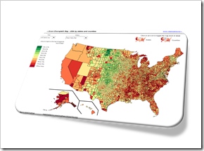
    Drill Down Choropleth Map USA

    The post Faster Choropleth Maps with Microsoft Excel provided a faster version to update a Choropleth Map in Microsoft Excel. The approach made it possible to use Choropleth Maps with several thousand regions on an interactive Microsoft Excel dashboard in production.

    This also opened up new possibilities to enhance the maps with additional features. Leonid Koyfman contributed a couple of great enhancements in the follow-up article Fast Choropleth Map with Enhanced Features like filtering the data by value bin, showing tooltips and letting the user decide whether the map shall be colored by state or by county.

    Very soon after this follow-up article was published, Leonid came up with another great idea. He suggested to take the user selection of how to color the map to the next level: let the user easily drill up and down the geographical hierarchy by simply clicking on the map. One click toggles from coloring the entire state to the counties in that state and vice versa. I have to admit, I am sitting on this nugget for one and half years already and never found (well, more precisely never took) the time to publish it. But finally the time has come. Here it is.

    Today’s article explains Leonid’s idea and implementation how to drill up and down geographical hierarchies on a Microsoft Excel Choropleth Map.

    The article includes two example workbooks for free download: the USA by states and counties and Germany by the two common ZIP-code levels PLZ2 and PLZ5 (first two digits of the ZIP-code and the entire five digits ZIP-code).

    (more…)

  • Pivot-like Marimekko Charts in Excel

    How to create an interactive “Pivot-like” Marimekko Chart in Excel allowing the user to select the visualized dimensions and measure on the fly

    Rubik's Cube - Photographer: Clemens Koppensteiner (flickr.com)The previous post Marimekko Charts in Microsoft Excel described and provided a VBA-based template to create a Marimekko chart in Excel made up of freeform textboxes. In the article I claimed, the used approach would offer some flexibility. Action speaks louder than words, so let’s turn this rhetoric into action.

    A Marimekko chart visualizes one measure (numerical) by two dimensions (categorical). The original template provided in the previous post was based on a data source arranged in a crosstab.

    Now let’s say you have a data source with several dimensions and measures organized in a flat table. That’s the norm, isn’t it? If you want to quickly analyze this data in Excel, you will probably use a Pivot Table and maybe a Pivot Chart allowing you to easily select which dimensions shall go to rows and columns and which measure shall be summarized in the values area. Now this is exactly the feature we want to bring to our Marimekko chart template.

    Today’s post describes how to enhance the existing template with interactive features to enable the user to easily define what shall be displayed in the Marimekko chart. As always, the article includes the Microsoft Excel workbook for free download.

    (more…)

  • Marimekko Charts in Microsoft Excel

    A VBA based Microsoft Excel Template to create a Marimekko Chart aka Matrix Chart aka Mosaic Chart for free download

    marimekko #2 - Photographer: 4WheelsofLux (flickr.com)A Marimekko or Matrix or Mosaic Chart (called Marimekko hereafter) is a combination of a 100% stacked column chart and a 100% stacked bar chart combined in one view. It works like a 100% stacked column chart, but additionally the width of a column is proportional to the total value of this column.

    Microsoft Excel does not provide a built-in chart type for Marimekko charts, but there are several workarounds available to accomplish this. For instance, Jon Peltier shows in his article Marimekko Charts how to turn a combination of a stacked area and a line chart into a Marimekko chart. My friend Chandoo, Conditional Formatting aficionado he is, uses the cell grid, formulas and cell value based formatting rules to create a pseudo Marimekko chart in his post Market Segmentation Charts using Conditional Formatting. Of course there are also a couple of other blog posts on this topic and also commercial Add-ins available.

    Although Jon’s and Chandoo’s solutions work well and are available for a long time already, I decided to add my 2 cents with another approach: a VBA based solution creating a Marimekko chart made up of freeform text boxes. The main advantage: reduced set-up time and more flexibility, if the number of rows and columns of the Marimekko chart changes.

    Today’s article provides a VBA based solution to create a Marimekko chart in Microsoft Excel and explains how to use and customize the template to suit your requirements. As always, the workbook is available for free download and the VBA code is without password protection.

    (more…)