Category: Data Analysis

  • Display all Fields of a Row in large Excel Tables

    How to simplify the exploration of large Excel tables by showing the entire data record of the active row in additional text boxes

    ©dsdsdsdsdsds / flickr.comFrom time to time most of us have to work with very wide tables in Microsoft Excel. Tables with 30, 40 or even more columns, too wide to be visible on your screen at a glance.

    When investigating this data, it is often the case that you would like to see some values from columns that do not fit on the screen at the moment. E.g. you would like to see the sales and the profit at a glance, but the columns are so far from each other that they are not visible at the same time.

    Sounds familiar? What are you doing? Scrolling back and forth? Hiding and unhiding columns? A second window? Whatever technique you are using, I would assume you are sometimes wishing for something more convenient. A feature that shows the entire data record of the active row without scrolling or any other additional actions.

    Today’s post provides such a feature to improve the navigation within wide data tables. Two additional textboxes automatically show the values of the invisible columns for the active row. No additional clicks necessary. Simply navigate through your worksheet and click on any cell in your data table and the textboxes will automatically update without obscuring the active row.

    As usual, the article provides the Microsoft Excel workbook for free download.
    (more…)

  • Charts in Excel Table Tooltips

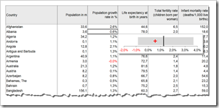
    How to display a Chart in the Tooltips on Microsoft Excel Tables visualizing the selected value within the context of the data distribution

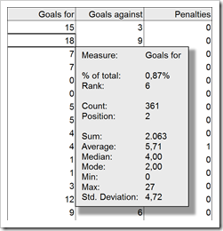
    Charts in Excel Table TooltipsThe recent post Tooltips on Microsoft Excel Tables showed a way of how to create tooltips in Microsoft Excel tables displaying additional information on the selected cell / value and some aggregated measures for the data in the active column, like sum, average, standard deviation and others.

    If you are particularly interested in setting the selected value into the context of the distribution of the entire data, you may want to have a visualization in your tooltips. In other words a chart as a tooltip on a numeric data table. Sounds like turning the whole tooltip idea and concept upside down, doesn’t it? However, from time to time this can be a great alternative for adding more analytical power to your Excel tables.

    Today’s post provides a short tutorial how to create a tooltip displaying a chart. As usual, including the Microsoft Excel workbook for free download.

    (more…)

  • Tooltips on Microsoft Excel Tables

    How to display Tooltips on Microsoft Excel Tables including additional information on the selected cell and aggregation results for the entire column

    Microsoft Excel Table TooltipsTooltips are a very helpful feature when exploring and investigating data. On charts and on plain data tables. When referring to tooltips, I am talking about additional details on the data currently selected or hovered over using the mouse. Tooltips could include other dimensions and measures, calculations or aggregated information like totals or averages.

    Tableau Software provides very powerful and easy to use tooltips. If you are working with Tableau, I once again recommend having a look at Andy Cotgreave’s great Tableau tooltip articles on the Data Studio (Tableau Tooltips: Conditional Formatting or Charts inside a tooltip? Yes, we can.). Thanks again for sharing, Andy.

    Compared to Tableau, Microsoft Excel’s tooltips functionality is next to nothing. We already had a post showing how to improve tooltips on Excel charts: Better Chart Tooltips with Microsoft Excel 2010.

    However, tooltips can be very helpful in plain data tables as well. Sure, Excel automatically displays some calculated aggregations of the selected range in the status bar. Yet, this is not enough. Your eyes always have to jump down to the status bar to see the information, the displayed quick calculations are limited and inflexible and you always have to select the range first. If you are working with larger data tables, you may wish for tooltips providing additional information on the selected value (like the percentage of total, the rank, etc.) and on aggregations across the entire column (like sum, average, etc.).

    Today’s post provides two slightly different approaches how to create better tooltips on Microsoft Excel tables. As usual including the Excel workbooks for free download.

    (more…)

  • Week in, week out, Tableau

    Week numbers with Tableau

    © Claudia Hautumm / www.pixelio.de The previous post discussed different methods of calculating week numbers and their effects on analysis and visualizations of data on a weekly basis. The post was focused on using Microsoft Excel.

    However, the challenge caused by different week numbering methods is not restricted to Microsoft Excel. I guess every data analysis and visualization software faces this problem.

    And so does my favorite: Tableau. There is no built-in way to switch between different week numbering methods in Tableau. But Tableau has the flexibility for an easy-to-use solution. This post provides all information of how to use ISO 8601 week numbers in Tableau, including a Tableau packaged workbook for free download.

    (more…)

  • Week in, week out, Microsoft Excel

    Week numbers with Microsoft Excel

    © Claudia Hautumm / www.pixelio.deFor analyzing and visualizing data on a timeline we are often consolidating the data on a monthly basis. Especially for monitoring and reporting, however, you need a higher level of detail, i.e. you will have to analyze and visualize your data by weeks.

    Unlike the months of the year, the definition of a week is not fully standardized. There are different approaches of how to calculate the numbers of the weeks. The results of the data analysis and the according visualizations depend on the week numbering method you are using.

    This post describes 3 different methods of numbering weeks and shows their impact on the resulting data visualization.

    (more…)