Category: Charts

  • Zooming in and out of Excel Charts

    Interactive zooming in and out on Charts in Microsoft Excel
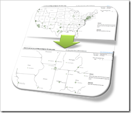
    Zoom in and out on Excel ChartsIf you have an XY scatter chart with a lot of data points in Microsoft Excel or even using an XY scatter chart mimicking a map in Excel, an interactive zooming function (allowing to magnify user-defined parts of the chart) can be very helpful.

    Microsoft Excel does not provide such a feature natively. There have been a few workarounds published. Most of them use interactive controls like spinners or sliders to change the axes scales with OFFSET formulas and dynamic cell ranges or by VBA.

    A more intuitive way of zooming into a chart would be to select an area on the chart with the mouse and zoom exactly into this user-defined part of the chart (or map).

    We recently had a couple of posts taking advantage of Andy Pope’s stellar idea to use a label control on top of a chart for interactive chart features:

    Another Technique for Interactive Excel Charts

    Selecting and Highlighting Areas on Excel Charts

    Select Areas on a USA Map in Microsoft Excel

    Andy’s technique is very versatile and can be a viable solution for many different use cases, including the requirement of an interactive zooming feature.

    Today’s post describes an implementation of an interactive zooming feature for a map (XY scatter chart) in Microsoft Excel. As always, the workbook is provided for free download.
    (more…)

  • Select Areas on a USA Map in Microsoft Excel

    Interactive radial or rectangular area selection on a map of the United States in Microsoft Excel

    One of the recent posts demonstrated how to mimic Tableau’s rectangular and radial map selection features in Microsoft Excel:

    Selecting and Highlighting Areas on Excel Charts

    The example workbook used a map of Europe. Since more than 40% of my readership is located in the United States, I thought it might be a good idea to also share a template with a map of the USA. Here it is for free download:

    Download Select and Highlight Areas on a US Map (zipped Microsoft Excel 2010 – 2013 workbook, 1.3MB)

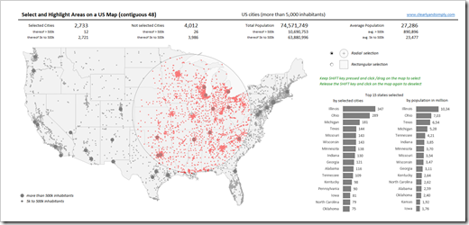
    This is an example screenshot of the dashboard:

    Interactive Selection on a USA Map in Excel - click to enlargeThe map (the contiguous 48 states, i.e. excluding Alaska and Hawaii) includes all cities in the United States with more than 5,000 inhabitants, divided into 2 categories (greater than or less than 500k inhabitants), visualized with different sizes of the dots.

    To define a radial or rectangular selection (choose with the radio buttons), keep the SHIFT key pressed, click somewhere on the map with the mouse key pressed, move the mouse to span the selection area and – as soon as you are done with your selection – release the mouse key. The metrics above the map and the bar charts (selection statistics by states) right to the map are updated on the fly.

    For more details on how to use the template and how this was implemented in Excel, please have a look at the original post.

    I hope this will be helpful, especially for my friends and readers in the United States.

    Stay tuned.

  • Cartograms in Microsoft Excel

    How to create Cartograms in Microsoft Excel

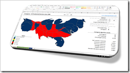
    Cartograms in ExcelThe article Cartograms in Tableau described the limitations of Choropleth Maps under certain circumstances and why Cartograms can sometimes be a viable alternative to color coded maps.

    Building upon that, the previous post (Create your own Cartograms in Tableau) provided a Microsoft Excel tool to create the polygons for Cartograms based on your own data. The Excel tool (called Cartogram Data Generator) is based on my VBA implementation of “an algorithm to construct continuous area cartograms” by J. Dougenik, N. Chrisman and D. Niemeyer, published in “Professional Geographer” back in 1985.

    With this VBA algorithm and two other techniques previously published here (Faster Choropleth Maps with Microsoft Excel and Create Excel Freeform Shapes from Polygons), we have all modules available to calculate and plot Cartograms directly in a stand-alone Microsoft Excel workbook.

    Today’s post describes how to create Cartograms in Microsoft Excel and provides two versions of the Cartogram workbook for free download.

    (more…)

  • Selecting and Highlighting Areas on Excel Charts

    Interactive Selecting and Highlighting Areas on an Map or an XY Scatter Chart in Microsoft Excel

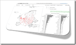
    Selecting and Highlighting on Excel ChartsThe previous post demonstrated an alternative technique to implement a direct interaction with an Excel chart using an ActiveX label control sitting on top of the chart. The example used in that post (a geography quiz) allowed a click on a map and evaluated the coordinates of the position the user clicked on.

    The technique, however, can also be used in many more cases. If you are working with an XY scatter chart and especially if you are working with a map, interactive selecting and highlighting a user-defined area of the chart can be a very helpful feature for exploring and analyzing the data.

    Tableau Software, for one, allows for different ways of selecting and highlighting areas. Microsoft Excel has no such features built in. With the technique described in the previous post and some additional VBA code, however, you can bluff almost the same functionality in Excel.

    Today’s article describes how to implement selecting and highlighting features on Excel charts. As always the example workbook and the VBA code is provided for free download.

    (more…)

  • Another Technique for Interactive Excel Charts

    Another technique to create interactive charts in Microsoft Excel using an ActiveX Label Control on top of the chart

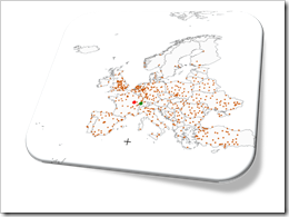
    Where is it?Interactive features add a lot of analytical power to dashboards. If you want to create a professional analysis dashboard, interactivity is almost a must-have.

    Unfortunately, Excel does not provide built-in interactive features for charts. However, this doesn’t mean you can’t have interactivity on Excel dashboards.

    As always, VBA is the way to overcome Excel’s shortcomings.

    We already had a couple of articles providing workbooks with interactive features, like Bluffing Tableau Actions with Microsoft Excel, The Next Level of Interactive Microsoft Excel Dashboards, Microsoft Excel Site Catchment Analysis, Better Chart Tooltips with Microsoft Excel 2010.

    All of them were taking advantage of the chart object’s mouse event procedures. More precisely, they were based on the great code provided by Jon Peltier here: Get XY on any Chart.

    I recently discovered another technique to implement interactivity on Excel charts. Andy Pope uses an ActiveX label control on top of a chart to track and evaluate mouse positions. Unlike the chart object mouse events, Andy’s approach doesn’t require to activate the chart first.

    I “stole” Andy’s idea and used his technique to create a little interactive geography quiz in Excel: find European cities on a map. Today’s article describes the implementation of the workbook and the code and – as always – provides the Excel file for free download.

    (more…)