An alternative design of Bullet Graphs: no qualitative ranges, additional data labels and a visualization of the performance gap (if applicable)
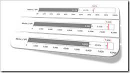 More than 10 years ago, Stephen Few of Perceptual Edge introduced the Bullet Graph: an alternative chart type to replace the formerly (and unfortunately sometimes still) popular gauges and speedometers on dashboards. A Bullet Graph visualizes a performance metric compared to a target (or other comparative measures) in a small, clear, simple and effective view. In the meantime, the Bullet Graph has become a widely respected, even standard chart type. Some major Data Visualization software applications like Tableau Software natively support Bullet Graphs.
Back in 2009, Matt Grams described a possible solution of creating Bullet Graphs in Excel here on Clearly and Simply: Bullet Graphs for Excel: A Simple Way?
I am using Bullet Graphs very often in my models for a very long time already, especially on Performance Measurement Reports and Dashboards. Starting with Stephen’s original design specification, I received a lot of feedback from my clients over the years. As a consequence, I made a few variations to the design of the Bullet Graph regarding the qualitative ranges, data labels and the performance gap (if applicable, i.e. if actual is smaller than target).
Today’s article describes my variations of the original Bullet Graph design, explains the background why I made them, shows how to implement the charts in Microsoft Excel and provides the corresponding Excel workbook for free download.
 The previous posts
  The previous post
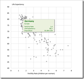
 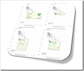 One of the previous posts described four different techniques how to create customizable, meaningful tooltips on XY Scatter Charts in Microsoft Excel:
 Back in December 2010, I published an article about