Category: Charts

  • Variations of Alternative Bullet Graphs in Excel

    Variations of the Alternative Bullet Graph Design: Visualization of Gaps and Exceedances, two Targets and two Gaps, conditionally formatted Actuals and dynamically sorted Multiple Rows Bullet Graphs

    Bullet Graph Variations

    One of the previous posts presented An Alternative Design of Bullet Graphs: no qualitative ranges, additional data labels and a visualization of the performance gap.

    These ideas can be taken a few steps further:

    • Bullet Graphs with a generalized visualization of the deviation of actual from target: display the gap, if actual is smaller than target and the exceedance otherwise
    • Bullet Graphs with two targets
    • Bullet Graphs with two targets and two gaps
    • Bullet Graphs with a conditionally formatted actual bar
    • Multiple rows Bullet Graphs in alternative design
    • Dynamically sorted multiple rows Bullet Graphs

    Today’s posts presents this set of possible variations of the alternative Bullet Graph design. As always, the article includes a link to download the Microsoft Excel template workbook for free.

    (more…)

  • Highlight Actions in Microsoft Excel with Multiselecting

    How to implement Highlight Actions in Microsoft Excel with the option to select more than one category (Multiselecting)

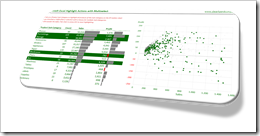
    Multiselect Highlight Actions Excel IntroClearly and Simply proudly presents another guest article: Leonid Koyfman, long-time contributor to this blog, enhances the approach to Highlight Actions in Microsoft Excel with the option to select more than one category. Leonid developed an impressively simple and elegant technique. Enjoy.

    The recent post Highlight Actions in Microsoft Excel provided a mechanism to replicate Tableau’s highlight actions in Microsoft Excel and focused on the specific use case when a selection of a row within the data table, or a bar of the “bar charts”, automatically highlighted related products on the XY scatter chart and shaded off all other data points.

    Getting closer to what can be done in Tableau, the suggested approach lacks an important Tableau functionality: multi-selection. In the Highlight Action Example in Tableau we are not limited to a single item selection. We can select multiple Sub-Categories with a mouse or CTRL-Click and this action will highlight the corresponding data points on the XY scatter chart.

    Today’s post includes a set of techniques and tricks to extend the dashboard presented in Highlight Actions in Microsoft Excel to mimic Tableau’s multiselecting feature.

    (more…)

  • Highlight Actions in Microsoft Excel

    How to implement a specific Highlight Action Use Case in Microsoft Excel
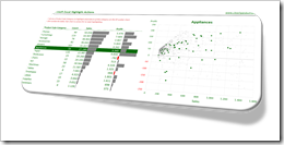
    Highlight Actions in ExcelHighlight Actions in Tableau allow you to visualize all data points related to a user-selection across different views on a dashboard by coloring the relevant marks and shading off all others.

    Highlight Actions are a great feature for interactive data exploration in general, but there is one specific use case where highlighting is extremely useful:

    Imagine you have a data set with a hierarchy of dimensions like Product Category|Product Sub-Category|Product, State|County or something similar. If this is the case, chances are that the dashboard will show consolidated results per e.g. Product Sub-Category in a table or Bar Chart and a distribution of all Products by two measures (e.g. Sales and Profit) on an XY Scatter Chart. With a Highlighting Action in place, you can easily click on one Sub-Category in the first view and immediately see all related data (i.e. all Products belonging to this Sub-Category) on the XY Scatter Chart. Highlight Actions are preferable to Filter Actions in this case, because they show the  members of the selected category within the context of the distribution of all data points.

    Creating Highlight Actions in Tableau is a piece of cake. A few mouse clicks and you are good to go. But what if you want to have a similar feature on your Excel dashboard? Unfortunately, Excel does not provide actions across views natively, but with a few lines of VBA code and a simple charting trick, you can replicate Tableau’s Highlight Actions in Microsoft Excel, too.

    We already had a couple of posts here providing similar functionalities with a comparable approach:

    Bluffing Tableau Actions with Microsoft Excel

    Highlighting on Excel Dashboards

      Mouse Driven Actions on Excel Dashboards

    Today’s post is along the same lines, but focusses on the specific use case described above. It explains how to create this particular Highlight Action in Excel and provides an example workbook for free download.

    (more…)

  • Alternative Bullet Graph Design in Tableau

    How to realize an alternative Design of Bullet Graphs in Tableau

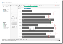
    Alternative Bullet Graph TableauThe recent posts suggested an Alternative Design of Bullet Graphs and an interactive version of a Bullet Graph. Both articles provided example workbooks in Microsoft Excel.

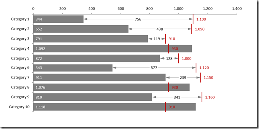
    These posts included three variations of the well known standard design of Bullet Graphs described in Stephen Few’s design specifications: no qualitative background areas (e.g. poor, satisfactory, good), data labels for actual and target as well as the visualization of the gap (target minus actual) with a data label and a span line to put the gap label into context, i.e. a thin line between actual bar and target line with arrows at the beginning and the end.

    How would this alternative design of a Bullet Graph look like in Tableau?

    Well, truth be told, I never managed to create an exact replica of my Excel implementation in Tableau. The Excel version is using error bars to display the span line of the gap. A comparable feature is not available in Tableau, but you can still realize the alternative design of Bullet Graphs in Tableau coming close to the Excel implementation.

    Today’s post presents a short description of how to realize my alternative design of Bullet Graphs on Tableau Public including the option to download the Tableau workbooks.

    (more…)

  • Interactive Bullet Graphs in Excel

    An interactive Multiple Row Bullet Graph in Excel displaying the gap and data labels only when hovering over a bar with the mouse

    The previous post presented An Alternative Design of Bullet Graphs in different versions and provided the implementation in a Microsoft Excel template workbook for free download.

    Long time Clearly and Simply readers and contributors Matt Grams (check out Matt’s guest post: Bullet Graphs for Excel: A Simple Way?) and Leonid Koyfman (Leonid’s LinkedIn Profile) liked the alternative design in general, but also came up with a justified and constructive criticism regarding the Multiple Row Bullet Graph:

    Multiple Row Bullet Graph - click to enlargeThey noted that

    • the chart is too busy and a bit overloaded, especially if you are using it in a relatively small size, e.g. on a dashboard with other views
    • in certain edge cases, the data labels may overlap and become unreadable

    Valid points. I fully agree with Matt and Leonid.

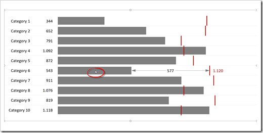
    To make the chart less busy and more readable, Leonid suggested to turn it into an interactive Bullet Graph which displays the span of the gap (the thin line with arrows between actual bar and target line) and the data labels for gap and target only, if the user hovers over the bar with the mouse:

    Interactive Bullet Graph - click to enlargePlease note the mouse cursor over the bar of Category 6.

    The underlying technique and VBA code is described here: Mouse Driven Actions on Excel Dashboards.

    This interactive version definitely looks much cleaner, but it also comes with a few disadvantages:

    • The user has to activate the chart (click on the chart area) first to make the mouse hover action available
    • The approach is not applicable for dashboards delivered in a static version like PDF or printed. It only makes sense, if the user directly interacts with the chart in Excel
    • Unlike the original version, this solution requires VBA code
    • Because of the VBA code, it takes more time to transfer the template from the example workbook to your own model. You can’t simply drag the sheet over to your file, you also have to copy the entire code from all objects, modules and class modules
    • It requires Microsoft Excel 2013 or later

    Anyway, it still is a viable and interesting alternative to the original version.

    Here is the Excel 2013/2016 workbook for free download:

    Download Interactive Bullet Chart (zipped Microsoft Excel 2013-2016 workbook, 32K)

    Many thanks to Matt and Leonid for the feedback and suggestions. Much appreciated.

    Stay tuned.