Create a motion chart and animate cumulative data using the new functionality “Show History” of Tableau 6
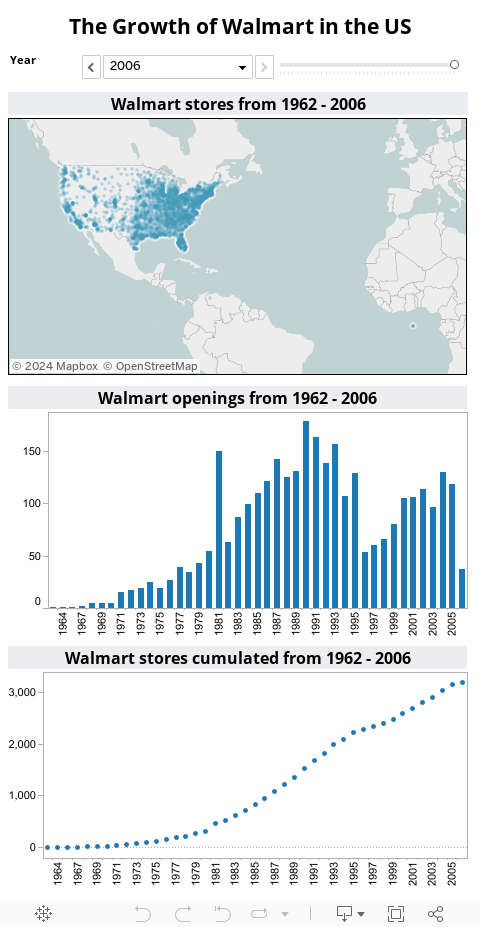
 The article Animate cumulative data with Tableau described a workaround to visualize the history of data on the page shelf of Tableau’s version 5. The example provided in that post showed the growth of Walmart since 1962 on a map of the United States.
The workaround included a custom SQL statement in the data connection to create a second date field to be used on the page shelf.
The workaround did the job, but it came with a couple of serious disadvantages:
- SQL knowledge needed to create the Custom SQL statement
- Additional time needed to set up the data connection
- Extremely slow performance: executing the SQL query after opening the workbook took between one and three minutes
- Impacts on other data analysis and visualizations due to the artificially bloated data source
As I already said at the end of the original article: A workaround. No more, no less.
All that belongs to the past. With Tableau 6 you can easily animate cumulative data on the page shelf using the new feature “Show History”. Today’s post includes a how-to tutorial and the Tableau workbook for direct access here and for free download.
Drag the dimension to the page shelf, check the box “Show History”, click on the little down arrow to get to the history settings and select “All” and “Marks”.

That’s it.
No complicated SQL statement, no Custom SQL data connection, no bloating the data from 3,000 to 5 million rows, no performance decrease.
A couple of mouse clicks and you see a high performing animation of cumulative data on a map. Rapid fire business intelligence.
Here is the workbook on Tableau Public:

Please be advised that Tableau Public doesn’t support the playback controls. If you want to see the animation using the playbacks, you will have to download the workbook and open it with the free Tableau Reader or Tableau Desktop (14-days free trial).
Show History is a very useful new feature. Thus, I added it to my list of how-to tutorials for future articles here on Clearly and Simply.
Stay tuned.
Update on November 24, 2010
Tom Brown of The Information Lab recommended in a comment to enhance the visualization with additional views on the total number of openings and total stores. Here is an enhanced version of the visualization:
Thanks Tom.
Leave a Reply