An alternative design of Bullet Graphs: no qualitative ranges, additional data labels and a visualization of the performance gap (if applicable)
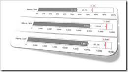 More than 10 years ago, Stephen Few of Perceptual Edge introduced the Bullet Graph: an alternative chart type to replace the formerly (and unfortunately sometimes still) popular gauges and speedometers on dashboards. A Bullet Graph visualizes a performance metric compared to a target (or other comparative measures) in a small, clear, simple and effective view. In the meantime, the Bullet Graph has become a widely respected, even standard chart type. Some major Data Visualization software applications like Tableau Software natively support Bullet Graphs.
Back in 2009, Matt Grams described a possible solution of creating Bullet Graphs in Excel here on Clearly and Simply: Bullet Graphs for Excel: A Simple Way?
I am using Bullet Graphs very often in my models for a very long time already, especially on Performance Measurement Reports and Dashboards. Starting with Stephen’s original design specification, I received a lot of feedback from my clients over the years. As a consequence, I made a few variations to the design of the Bullet Graph regarding the qualitative ranges, data labels and the performance gap (if applicable, i.e. if actual is smaller than target).
Today’s article describes my variations of the original Bullet Graph design, explains the background why I made them, shows how to implement the charts in Microsoft Excel and provides the corresponding Excel workbook for free download.
An introductory Remark on the Intention of this Article
Let me start with expressing my tremendous respect for Stephen Few’s work and publications. It goes without saying that I have read his books and most of his White Papers and I learned a lot about Data Visualization.
Today’s article is not meant as a fundamental criticism of Stephen’s Bullet Chart Design or even a request to change the specification. Not at all. This post simply presents the variations of the original Bullet Graph Design which work best for me in most cases. No more, no less.
Stephen Few’s Original Bullet Graph Design Specification
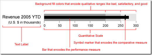
The standard Bullet Graph looks like this:
The image is taken from Stephen Few’s detailed Bullet Graph Design Specification.
As mentioned in the introduction, the Bullet Graph I am using most of the time deviates a little bit from Stephen’s specs. The following section describes the differences between the original design and my version.
Variations of the Original Bullet Graph Design
Variation 1: No Qualitative Ranges (e.g. poor, satisfactory, good)
The first variation of the original design is the omission of the qualitative ranges, i.e. the background fill colors which usually visualize ranges like poor, satisfactory and good. Actually this isn’t even a deviation from the original specs, because Stephen classifies the qualitative ranges as optional.
Anyway, I am never using the background ranges and here is why: companies and other organizations spend a lot of time on the discussion and agreement of the target values for their Key Performance Indicators. And they do this for a very good reason: at the end of the process, the entire organization has a clear and common understanding of the target values and everyone agreed and committed to the objectives.
However, according to my experiences, defining qualitative ranges like poor, satisfactory and good isn’t part of this process in most companies, i.e. there is usually no common understanding or agreement of what is poor, satisfactory and good for a certain metric.
Now, if this is the case and you still use the qualitative ranges in a Bullet Graph, the areas either simply divide the axis range into three equal parts or they only reflect the analyst’s (or whoever created the visualization) opinion of what is poor, satisfactory and good. As long as the audience does not understand the areas or – even worse – does not agree with their sizes, the qualitative ranges are not helpful. In best case, the audience ignores them. At the worst, they may irritate people or lead to lengthy and unfruitful discussions.
Variation 2: Data Labels for the Actual and Target Value
Some data visualization purists claim that the chart itself (i.e. its graphical elements) should tell the story and therefore labeling data points should be avoided. I agree to this, if too many labels clutter the display or do not provide additional insights. It always depends on the chart type, the number of data points and the objective of the view.
Sometimes, however, data point labels can be very helpful. And this is the case for Bullet Graphs, too. Imagine you have a dashboard with a dozen or even more metrics visualized on Bullet Graphs. The charts will help you to easily identify the metrics with the largest underperformances at a glance, even without looking at the exact numbers. If you then have a closer look at those underperformers, you are certainly interested in the exact values of the metric and the target.
On a Bullet Graph, labeling the data points neither clutters the display nor significantly decreases the data/ink ratio. But it does provide helpful additional information and insights.
With these two small variations in place, a Bullet Graph looks like this:
 Variation 3: Visualizing the Performance Gap (if applicable)
The third variation is only an extension of the second one and it is based on the experiences I made with Bullet Graphs during the last few years. When I presented a dashboard with Bullet Graphs as the one shown above, I often received comments like this:
“So, that means we are, uh, …, wait a second, …, 1,518 units short this month?”
I really heard that a lot. That was evidence to me that the gap between actuals and target is important. Now, if people look at your dashboard and start calculating numbers by doing mental math or using the calculator on their smartphones, there is clearly something missing in your visualization.
Thus, I added the exact number of the performance gap and a span (a line with arrows at beginning and end) to visualize this apparently important information:
 Instead of showing the gap as a number, you can also display it as a percentage of the target. In this example, the performance gap makes 20.2% of the target:
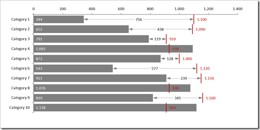
 Last, but not least, the alternative design is also applicable for a Performance Measurement Bar Chart, i.e. several Bullet Graphs combined in one single view:
 So much for the descriptions of my small design modifications to Bullet Graphs. Now on to the more technical part: the following section contains a short overview how to implement this chart type in Microsoft Excel.
Implementation in Microsoft Excel
Microsoft Excel does not (yet?) natively support Bullet Graphs. Hence, we have to use a combination chart to make up a Bullet Graph in Excel: a bar chart to plot the actual and an XY Scatter chart for the target.
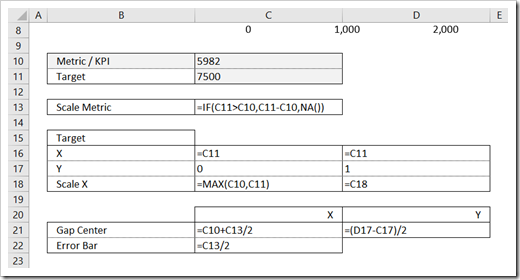
To do so, we first need a few extra cells with values and calculations to provide the necessary data sources for the chart:
- Two input cells for the values of actual and target (cells C10 and C11)
- XY values to plot the target line (cells C16:D17)
- Since the two chart types have to be plotted on two axes, we need scale values to make sure the axes will have the same bounds. The scale value for the bar (cell C13) uses an IF-clause to return the deviation if target is larger than the actual and #N/A otherwise. The actual and this scale metric will then be plotted on a stacked bar chart (see below)
- The scale dummy for the secondary axis (the target) is calculated in cell C18 and D18 with a simple MAX function
- The Gap Center in row 21 is needed to display the span line with the arrows using Excel’s error bars
- Finally the size of the error bars is calculated in cell C22
So much for the set-up.
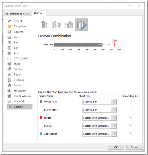
Next, we insert a combination chart as follows:
- Metric and Scale Metric are plotted on the primary axis as a Stacked Bar Chart. Target, Scale X (Target Scale Dummy) and the Gap Center are plotted as an XY Scatter Chart with Straight Lines on the secondary axis.
- The data series Scale Metric, Scale X and Gap Center are formatted to be invisible, i.e. no fill color, no line, no marker.
- Data Labels are added to the Metric and Target data series.
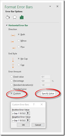
- Finally we select the Gap Center data series, add horizontal error bars and format them like this:
- Some more formatting of the error bars (line width, line color, end arrow type) and we are done.
Agreed, this is not a really detailed tutorial, but it covers the main steps. If you are interested in all the details, please download the workbook and have a look.
The Download Link
Here is the template workbook with all charts shown above for free download:
Download Bullet Graphs with Performance Gaps (Microsoft Excel 2013-2016, 47K)
There is no VBA included, so you can easily drag one or several of the worksheets from this template and drop it into your own workbook.
Please be advised that the worksheet displaying the performance gap as a percentage of the target ([Bullet Graph general w Gap 2]) will only work with Excel 2013 or higher. The chart on this sheet uses the feature to display data labels from defined cell ranges. This option is not available in Excel 2010 and earlier. The charts on all other sheets, however, will work with Excel 2007 and 2010, too.
What’s Next?
The Bullet Graph approach described in this post can be extended in different ways like
- a span and the value for overachievements (i.e. actual exceeds target)
- two targets and two gaps
- conditionally formatted charts
One of the next posts will present a selection of Performance Measurement Charts in Microsoft Excel.
Stay tuned.
Update on 12th of May, 2017
The workbook originally posted for download had a bug on the sheet [Bullet Graph 100% w Gap]. The label of the gap was wrong. I fixed the issue now. If you already downloaded the file, please download the workbook again. Many thanks to Al for pointing this out.
Leave a Reply