How to realize an alternative Design of Bullet Graphs in Tableau
 The recent posts suggested an Alternative Design of Bullet Graphs and an interactive version of a Bullet Graph. Both articles provided example workbooks in Microsoft Excel.
These posts included three variations of the well known standard design of Bullet Graphs described in Stephen Few’s design specifications: no qualitative background areas (e.g. poor, satisfactory, good), data labels for actual and target as well as the visualization of the gap (target minus actual) with a data label and a span line to put the gap label into context, i.e. a thin line between actual bar and target line with arrows at the beginning and the end.
How would this alternative design of a Bullet Graph look like in Tableau?
Well, truth be told, I never managed to create an exact replica of my Excel implementation in Tableau. The Excel version is using error bars to display the span line of the gap. A comparable feature is not available in Tableau, but you can still realize the alternative design of Bullet Graphs in Tableau coming close to the Excel implementation.
Today’s post presents a short description of how to realize my alternative design of Bullet Graphs on Tableau Public including the option to download the Tableau workbooks.
Alternative Bullet Graph without Gap
Omitting the qualitative ranges and displaying the data labels is a walk in the park: if you are using the Bullet Graph in Tableau from Show Me to create the view, simply remove the reference line [60%, 80% of Average Value]. Next, add mark labels to the actuals (Analysis|Show Mark Labels) and to the target line (Edit Reference Line and set Label to Value). The Bullet Graph then looks like this:
 The challenge of the alternative Bullet Graph design in Tableau is visualizing the gap between actuals and targets. As mentioned in the introduction, working with an error bar is not an option. So, here are the two possible solutions I can think of:
Alternative Bullet Graph with Gap Version 1 – Stacked Bar Chart
First of all, you need a Calculated Field for the gap value:
IF [Target] > [Value] THEN
[Target]-[Value]
ELSE
Null
END
Not much to explain here, I guess. The gap is the difference between [Target] and [Value], if target exceeds value and Null otherwise.
Next, you put Measure Values to the Columns Shelf and Measure Names to the Filters Shelf and select [Value] and [Gap] in the Filter dialogue. Drag Measure Names to the Colors Card of the Marks Shelf and format the bars as you like, e.g. the value with a dark grey and the gap with a light grey:
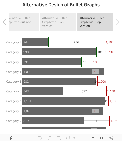
 Alternative Bullet Graph with Gap Version 2 – Gantt Bar

The second approach tries to get closer to the span line between value and target by using a Gantt Bar as the Marks type for the gap. Here are the steps:
- Create a Calculated Field called [Gap Start]:
IF [Target] > [Value] THEN
[Value]
ELSE
Null
END - Drag [Gap Start] to the Columns Shelf, put it on the Dual Axis and synchronize the axes
- Set the Marks type of [Value] to a Bar Chart (instead of Automatic)
- Set the Marks type of [Gap Start] to a Gantt Bar
- Drag [Gap] to the Size Card of the Marks Shelf
- Reduce the size of the Gantt Bar to get to a thin line
- Drag [Gap] to the Label Card of the Marks Shelf
- Format the view as you like (colors, number formats, etc.)
Finally,the Tableau worksheet looks like this:
You can switch between the three versions described above using the story points at the top and download the workbook by clicking on the download button at bottom right.
Final Remark
Truth be told, I like the appearance of the Excel implementation better than the Tableau approaches described above. In my humble opinion, the thin span line with the arrows at start and end of the line is the perfect way to put the data label of the gap into context: it is intuitive and optimizes the data/ink ratio. However, I can’t think of a way how to do this in Tableau. This doesn’t mean it is impossible, it is just above my head. If you have an idea of how to improve the Tableau approaches shown above, please drop me a comment.
Stay tuned.
Leave a Reply