Dynamic Hierarchies with Tableau

How to add dynamic, interactive hierarchies to your Tableau Dashboard

The second article of a guest post series on “Expand your Reach in Tableau with Parameters”

Confirming the hierarchy / Photographer: patries71 (flickr.com)This is the very long expected continuation of a guest post series by Sheel Bhatiani, Lead Software Developer at Cheyne Capital. We started Sheel’s series already back in November last year, but ever since I left you waiting. Please blame it on me, it is not Sheel’s fault. It is my bad. When starting the series, I have simply bitten off more than I could chew and I didn’t find the time to do the final editing and to publish the next article.

However, better late than never. The wait is over and here is Sheel’s second post. Enjoy.

My first post Dynamic Sorting with Tableau introduced a technique to expand your reach in Tableau. One Parameter combined with one Calculated Field enables you to add an interesting additional feature to an interactive dashboard: let the user decide the sort criterion and the sort order for a selected view.

Today’s second article of my guest post series “Expand your Reach in Tableau with Parameters“ will use a similar technique for adding a similar interactive feature: let the user decide which hierarchy shall be shown in a view. Again, the post includes the background, a detailed step-by-step tutorial and the dashboard for direct interaction here or the option to download the workbook via Tableau Public.


The Background – Hierarchies in Tableau

First things first: What is a hierarchy in Tableau?

Even if you have never heard of hierarchies in Tableau before, I bet you already used them. Tableau automatically creates hierarchies for all date fields in your source data. This way, you can easily break the dates down into year, quarter, month, etc. On top of this default Tableau behavior, you can also create your own hierarchies for other dimensions.

Let’s have a look at the Superstore Sales sample data coming with each Tableau installation. You find the following dimensions in this example: customer state, region and ZIP code. All of them are geographical fields and they have an inherent order. State first, region second, ZIP code last. Thus, it definitely makes sense to create a geographical hierarchy containing these three fields and to allow an easy drill-down through this order. The following image shows step by step how to do this:

How to create a hierarchy - click to enlarge

As an alternative to this standard way of creating hierarchies, you can also simply drag one or several dimensions on top of another one and the Create Hierarchy dialogue shown in step 2 will automatically pop up.

Easy, isn’t it? A few mouse clicks and you created a hierarchy with all the features you already know from the date hierarchy Tableau automatically provides. Dragging the hierarchy itself or one of its members e.g. on the row shelf lets you drill down and up by simply clicking on plus and minus signs shown on the pills:

Drill down a hierarchy - click to enlarge

There is a less known additional functionality. This feature also exists in the view itself: the plus and minus signs are available in the row headers, too.

That’s a very quick way to interact with your view, isn’t it?

Of course you can create hierarchies for all fields in your data as long as it makes sense. In the Superstore Sales data, for one, you may also create a product hierarchy containing product category, product sub-category and product name.

The Idea – Parameters to Expand your Reach with Hierarchies

Hierarchies are a great Tableau feature to structure your data and to improve the way you interact with your views. However, even if you want to show the same measure (let’s say SUM ([Sales])) by different hierarchies (let’s say geography and product), you need two separate views:

Dashboard hierarchies classic - click to enlarge

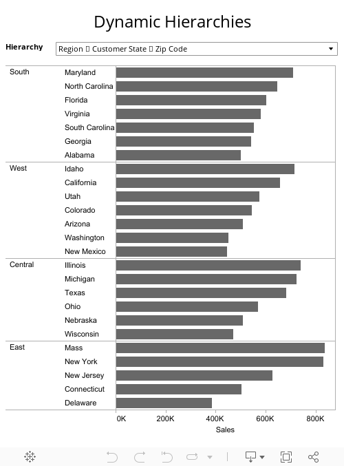
Wouldn’t it be nice to have only one view (i.e. one bar chart) and let the user decide whether he wants to see the data by geography or by product? Something like this:

Dynamic hierarchy dashboard - click to enlarge

Only one bar chart and a simple drop down is giving the user the choice to decide how to slice the data. Is this possible?

Yes it is and it is pretty simple, too. The key to this are again Parameters in combination with Calculated Fields.

The Step-by-Step How-to

Step 1: Create Hierarchies

See the first section of today’s article how to create a hierarchy and define one for the geographical data and one for the product, as already used in the views above.

Step 2: Create a Parameter

Create a new Parameter, give it a meaningful name like “Hierarchy Chooser”, select string as the data type, choose list as the allowable values and enter texts to name the 2 hierarchies like “Region ► Customer State ► Zip Code“ and “Category ► Sub-Category ► Product Name”. Similar to the Parameter we used in the basic approach of Dynamic Sorting with Tableau, we are using horizontal triangles within the strings to indicate that those texts are representing hierarchies. Here is a screenshot of the Edit Parameter dialog window:

Parameter hierarchy chooser - click to enlarge

Step 3: Create Calculated Fields

This step is a bit tedious. We need one generic Calculated Field for each hierarchy level. Let’s call the first one “Hierarchy Level 1”. The calculation is a simple CASE WHEN statement, assigning the first level of the existing two hierarchies according to the Parameter defined in Step 2. In other words, “Hierarchy Level 1” will be [Region] if the Parameter equals “Region ► Customer State ► Zip Code“ and [Product Category] otherwise. The Calculated Field dialog looks like this:

Calculated field hierarchy level - click to enlarge

We repeat this step and create a Calculated Field called “Hierarchy Level 2” and assign either [Customer State] or [Sub-Category] and a third one (“Hierarchy Level 3”) for the third level of the hierarchies.

Step 4: Create a generic Hierarchy

Combine the three Calculated Fields created in Step 3 to a new generic hierarchy called “Dynamic Hierarchy”.

Create generic hierarchy - click to enlarge

Step 5: Use the generic Hierarchy on the Row Shelf

Create only one bar chart (instead of two) with SUM ([Sales]) on the column shelf, but this time drag [Dynamic Hierarchy] to the row shelf and drill down using the plus sign of the pills.

Step 6: Show Parameter Control

Last step is to show the Parameter Control on the view for direct user interaction.

That’s it.

Here is the interactive version on Tableau Public:


Where is the beef?

Sounds like a nifty little workaround, but where is the beef? What is the big whoop? It is about saving real estate.

Real estate is the most limited resource on a dashboard, no doubt about it. If you are building an analytical visualization your users are interacting with, the described technique helps to save a lot of space. Room you can use for other views and thereby enable your users to get more insights from the dashboard.

The Drawbacks

The technique comes with a few drawbacks:

  • Additional time needed to set up the hierarchies, the Parameter and the Calculated Field
  • If you are using hierarchies with a different number of levels, e.g. the first hierarchy has three levels and the second one has only two, you have to use an empty string or Null for the third level of the second hierarchy. You can still drill down to the third level, but there would be no data if the second hierarchy is selected.
  • Increased efforts for maintaining your workbook if e.g. dimension names are changed or additional levels shall be added to the hierarchies.

From my point of view only minor drawbacks, but please decide for yourself.

What’s next?

It goes without saying that the next post will continue this series. The next article will describe how to use parameters to let the user select the mark types of a view.

Stay tuned.

Comments

27 responses to “Dynamic Hierarchies with Tableau”

  1. Max B Avatar
    Max B

    Thanks so much for this tips…
    I’ve been looking on how to make this workaround for quite a while now and you came up with the perfect solution.

  2. Trevor C Avatar
    Trevor C

    This is awesome, thanks so much for posting this! One quick question though (and try not to laugh)…
    How do you insert those horizontal triangles in the text strings? I’ve tried copying the symbol from Word but it just shows up as a  char when I paste in Tableau. Am I missing something?
    Thanks again!

  3. Robert Avatar

    Trevor,
    thanks for your comment.
    Actually I inserted the triangles by copying and pasting from a text editor, too. I would assume you may have used symbols from a special font like “Symbol” or “Wingdings”. If you chose a symbol from the normal text font, it should work.
    Having said that, please be advised that – for whatever reason – the horizontal triangles looked better back in Tableau version 6 than they do now in version 7. Especially the triangles to the left and right. The triangles to the top and bottom still look good in Tableau 7. Don’t ask me why.

  4. Anjali Avatar
    Anjali

    Hi,
    I have a doubt regarding multiple hierarchies. What can we do if we have two different streams of hierachies under a single field?
    for ex: say i have a field named ‘product’ which has two parts ‘gen1’ and ‘gen2’, both having further divisions. In the dashboard when the main field ie. ‘product’ is clicked then both ‘gen1’ and ‘gen2’ should be displayed. Can we do this in tableau?
    note: gen1 and gen2 share same position. ie. one doesn’t come under the other.

  5. Robert Avatar

    Anjali,
    thanks for your comment. I don’t think this is possible. The advantage of a hierarchy is the ability to quickly drill up and down through the hierarchy levels by clicking on the plus and minus signs of the pills on the shelves or by selecting an item in the headers of the view and clicking on “drill down” in the right click menu. How should this work in your case? If you would want to drill down product, how would Tableau be supposed to know if you want to drill down to gen1 or to gen2?
    Or am I misunderstanding you and gen1 and gen2 aren’t dimensions but members, i.e. products? If so, I think you can get what you want with defining a group: right click on the dimension and select Create Group.

  6. Anjali Avatar
    Anjali

    Thanks, Robert.

  7. Ali Avatar
    Ali

    Hi, this post is very helpful. Now maybe this is already answered above and I’ve missed it but I was wondering, if I have a data set that changes within those hierarchies (for example hierarchy level 3 values are added or different for every user), will the grouping ( + – ) dynamic enough to include those new values?

  8. Robert Avatar

    Ali,
    if the values of your data records change or if you are adding or deleting data records, you do not have to change anything. Tableau will automatically display the new / changed data within the defined dynamic hierarchies.
    Only if you want to change the definition of the dynamic hierarchies by e.g. adding a dimension as an additional hierarchy level, you will have to adjust the parameter and the calculated fields.

  9. Nathan Avatar
    Nathan

    Robert, would this work if one of your hierarchies has a different number of levels than the other?
    For instance, could you have one drop-down choice be Category ► Sub-Category (2 levels) and the other be Region ► State ► City (3 levels)?

  10. Robert Avatar

    Nathan,
    yes this is possible.
    Let’s assume [Product Name] wouldn’t exist in the example above. All you have to do is to change the Calculated Field [Hierarchy Level 3]. It would look like this:
    CASE [Hierarchy Chooser]
    WHEN ‘Region ► Customer State ► Zip Code’ THEN STR([Zip Code])
    WHEN ‘Category ► Sub-Category’ THEN “”
    END
    If you then select the hierarchy with 2 levels, Tableau will still show a third column, but this one would be empty and the view will look like a 2 level hierarchy.

  11. ivy Avatar
    ivy

    Absolutely amazing! Thank you for this!

  12. JT Avatar
    JT

    Hi,
    I tried creating dynamic hierarchy in tableau 9.2
    The calculated field is not accepting hierarchy name.
    Please advise

  13. Robert Avatar

    JT,
    the technique is still working with Tableau 9.2. It is not a version issue.
    If the Calculated Field is not working in your workbook, I’d assume there is a syntax problem in your formula. Maybe the quotation marks are wrong, e.g. you are using smart quotes instead of straight ones?

  14. Nilesh Avatar
    Nilesh

    how i can create drill down in Pie chart?
    using hierarchies or any other option?

  15. Robert Avatar

    Nilesh,
    I think this Tableau Forum thread should point you into the right direction:
    https://community.tableau.com/thread/119148

  16. Roy Leiser Avatar

    Hey Robert,
    Thank you for the smart and creative work around.
    Most of our dashboards use table-like graphs. Using this method I am unable to change the titles of the columns in the table (it will show only Hierarchy 1/2/3.
    Can you think of a solution for this issue?

  17. Robert Avatar

    Roy,
    I am not sure I understand your question correctly, but if you select “Show Header” for the hierarchy level dimensions on the Columns Shelf and hide the field labels for columns, the table should look as you probably want it to.
    If I misunderstood your question: can you post an example workbook somewhere? I will then have a look as soon as I have the chance to.

  18. Khizer Avatar
    Khizer

    this is absolutely great.
    thank you so much..

  19. Nick Harris Avatar

    Hi Roy,
    Are we able to show the correct headers with this method?
    Thansk!

  20. Robert Avatar

    Nick,
    I am sorry, I do not understand your question. What do you mean by “correct headers”?

  21. Chin Avatar
    Chin

    Hello Roy,
    First of all, Nice workaround. Very good work.
    However, There will be a formatting issue if we use your solution and put datetime field in the selection.
    For Example, If I use Quarter > Month > Week values in Parameter and than use your solution I will not see proper formatted values of quarter month and week.
    Do you have a workaround for formatting?

  22. Robert Avatar

    Chin,
    you can use the function DATENAME to display the desired values.
    The Calculated Field Hierarchy 1 (Quarter) would then look like this:
    CASE [Hierarchy Chooser]
    WHEN ‘Region ► Customer State ► Zip Code’ THEN [Region]
    WHEN ‘Category ► Sub-Category ► Product Name’ THEN [Product Category]
    WHEN ‘Quarter ► Month ► Week’ THEN “Q”+ DATENAME(‘quarter’,[Order Date])
    END
    Hierarchy 2 (month):

    WHEN ‘Quarter ► Month ► Week’ THEN DATENAME(‘month’,[Order Date])

    Hierarchy 3 (wwek):

    WHEN ‘Quarter ► Month ► Week’ THEN DATENAME(‘week’,[Order Date])

  23. Praveen Avatar
    Praveen

    This is a very handy workaround. Thank you for sharing.
    I am currently working on building a tableau report that needs to display dynamic hierarchies from a unary recursive relationship in a single table.
    A table that has parent relationship to rows within itself.
    Example: an employee table that has an employee ID and a supervisor id(managers employee ID) as a parent
    How do we build an organization structure in a report and display measures with dynamic hierarchies that can be drilled down up to the level of detail ‘CASE’ where data is available in the table.
    Any quick pointer you can provide is sincerely appreciated.
    Thank You

  24. Robert Avatar

    Praveen,
    I think your problem is less the task of building a dynamic hierarchy as described above, but rather the question how to detect the level of hierarchy for each employee in your data source.
    I found this thread on the Tableau forums where Tableau Zen Master Jonathan Drummey apparently provides an SQL based solution for the problem:
    https://community.tableau.com/thread/146224

  25. Raj Avatar
    Raj

    Hi Robert,
    Great work around !!! A million thanks!
    My question is similar to Roy’s. When we use the approach described in a table format, the columns headers read “Hierarchy Level 1”, “Hierarchy Level 2”, so on. Even when we download the table data to crosstab, it shows columns names as “Hierarchy Level 1”,.. This is understandable. But how do we tweak it to show the dimension name of what is displayed in the “Hierarchy Level 1” or “Hierarchy Level 2” dynamically?
    For Example:
    Hierarchy Option 1: Country -> State
    Hierarchy Option 2: State -> City
    When Option 1 is chosen, the first column in the table should show the column header as “Country”. When Option 2 is chosen, the first column header in the table should show the column name as “State”.
    Do you think this is possible?
    Thanks a lot in advance.

  26. Robert Avatar

    Raj,
    the texts “Hierarchy Level 1” and “Hierarchy Level 2” are the names of the Calculated Fields and I do not know of a way how to directly make names of Calculated Fields dynamic according to a parameter selection.
    There is a workaround, though, based on additional Calculated Fields, additional worksheets and floating sheets on a dashboard. I think this might be a way to get what you want. Have a look at this Tableau Knowledge Base article:

    Tableau KB: Creating Dynamic Column Headers

  27. Raj Avatar
    Raj

    Thanks for the response Robert! Really appreciate it!!!
    I did come across that tutorial video before. But the downsides with that approach is that (1) responsiveness of the dashboard takes a hit & (2) when we export the table data in a cross tab format the column headers will not show the dynamic header.

Leave a Reply

Your email address will not be published. Required fields are marked *