6 Famous Paintings in Tableau

Visualize 6 world famous paintings with Tableau Software
© Songkran / flickr.comIt has been a very long time since the last post here on Clearly and Simply: the start of a guest post series by Sheel Bhatiani about how to Expand your reach in Tableau with Parameters.

Ever since I was so snowed under with work that I wasn’t able to do the final editing and formatting of Sheel’s articles. I hope for your understanding.

I know that most of you are eagerly waiting for the guest series to be continued. Agreed, it is long overdue, but please bear with me, I can’t let this one go: Yesterday the Art Newspaper published that the earliest copy of the Mona Lisa has been found at the Prado in Madrid, Spain. Today, Darren Chalk over at The Data Studio published the first article of a series of posts about Art in Tableau.

This reminded me of publicly available data sets to visualize famous paintings like van Gogh’s Self Portrait, Botticelli's The Birth of Venus and – you guessed it – Leonardo da Vinci's Mona Lisa.

Way back in June 2010, I already published an emulation of a piece of art using Tableau: The Tableau Replica of Curtis Steiner’s 1,000 Blocks and – although totally useless for business applications – that post was very well received by my readers.

Thus, I just can’t let this opportunity slip through my fingers and I intersperse this little article before we will continue with Sheel’s next article.

6 Famous Paintings in Tableau

So, here are 6 famous paintings visualized with Tableau Software:

Leonardo da Vinci’s Mona Lisa
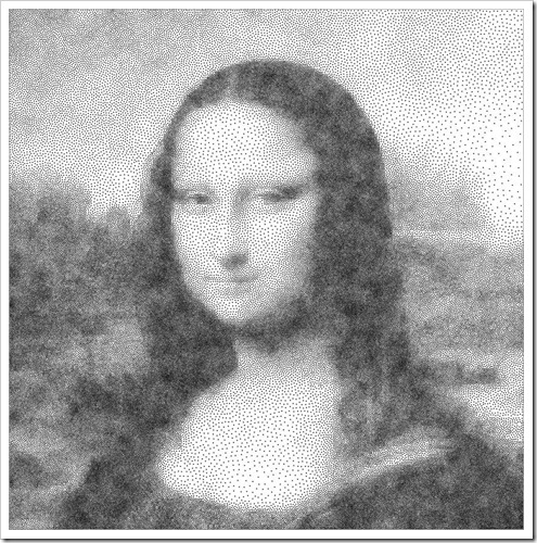
Leonardo da Vinci’s Mona Lisa

Jan Vermeer's Girl with a Pearl Earring

Jan Vermeer's Girl with a Pearl Earring

Sandro Botticelli's The Birth of Venus

Sandro Botticelli's The Birth of Venus

Vincent van Gogh's Self Portrait 1889
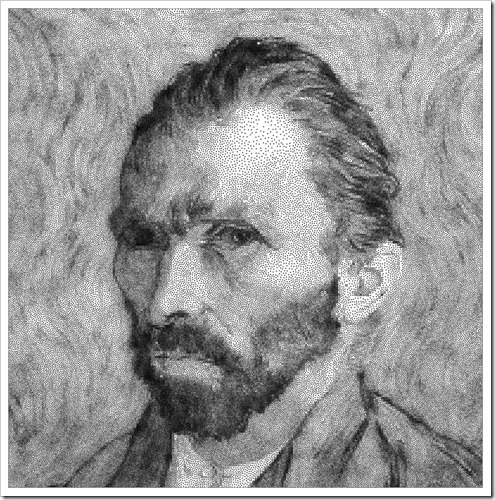
Vincent van Gogh's Self Portrait 1889

Diego Rodríguez de Silva y Velázquez’s Juan de Pareja
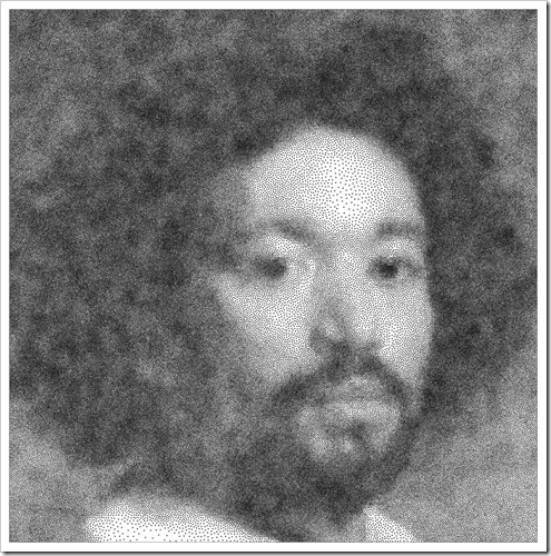
Diego Rodríguez de Silva y Velázquez’s Juan de Pareja

Gustave Courbet's The Desperate Man

Gustave Courbet's The Desperate Man

The Tableau Workbook

Unfortunately I cannot provide the workbook on Tableau Public, since Public is limited to 100,000 data rows. The data sets for all 6 paintings, however, are exactly 900,000 rows. Thus, I can only offer the screenshots above and the Tableau workbook for free download:

Download 6 Famous Paintings (Tableau Packaged Workbook, 2,146.6K)

To open this workbook you need Tableau Desktop 7.0 (trial version here), Tableau Public or the free Tableau Reader.

Please be advised that Tableau needs a few seconds to render the data points of the view when opening the workbook or after you used the filter to switch to another painting.

The Technique

Not much to say here. The used visualization technique is as simple as can be:

  • a XY scatter plot
  • a full circle as the shape
  • minimized size of the shape
  • fixed axes scales and hidden axes headers
  • a filter to let the user select one of the paintings
  • disable the “Show All Value” in the quick filter

That’s it. As soon as you have your data ready, it takes less than 5 minutes to create this visualization.

The Data Source

The data sets are coming from a website called Traveling Salesman Problem run by the Georgia Tech. You can get tons of example data sets for the TSP there and – surprisingly enough – also the data sets of the 6 paintings used above. They refer to a painting as a Traveling Salesman Problem and they even have the results of the (so far) best routes visiting all data points.

Can you imagine? The shortest route through Mona Lisa? And you thought I would be a data geek!

What’s Next?

The next posts will continue Sheel Bhatiani’s guest post series “Expand your reach in Tableau with Parameters”. Sheel’s next article will come soon. At the same time I am also working on some new Excel workbooks and articles.

Please stay tuned.

Comments

15 responses to “6 Famous Paintings in Tableau”

  1. Marko Avatar
    Marko

    Great post Robert!!
    It’s funny I was having a conversation with my manager to converting images to Tableau.
    Also, I hope you post your wizardy dashboard excel books blogs!!!
    A very eager fan 🙂

  2. Robert Avatar

    Marko,
    thanks for your comment.
    Actually, you can do the same visualizations with a XY scatter chart in Excel, too. I didn’t post the Excel workbook for download since it has 35MB.
    By the way, Ivan Moala provides a very interesting tool for converting images to Excel workbooks here:
    Image to XL by Ivan Moala
    I thought you might be interested.
    I am working on new Excel models. However, the next posts will be Tableau articles.
    In any case, please stay tuned.

  3. miguel Avatar
    miguel

    Genial, but weird, isn’t it? I’d never expected such a post.
    Cheers

  4. Tableaujedi Avatar

    Very nice. For things with a fixed aspect ratio, you can use a background image of a single pixel (or one with more if you don’t want a square). Then you don’t have to worry about how Tableau automatically sizes the axes independently.
    Interestingly, if you bucket the X,Y coordinates into bins of size 155 (INT([X]/155)) and put number of records on the size shelf, you can still depict the painting and it fits on Tableau Public
    http://public.tableausoftware.com/views/6FamousPaintings/6FamousPaintings?:embed=y

  5. Robert Avatar

    Marc,
    many thanks for your comment, for your tips and for bringing the visualization to Tableau Public.
    Interesting approach. The resolution suffers a little bit because of the bins, but still very nice. Thanks!

  6. joe yang Avatar
    joe yang

    Could we have a step by step tutorial?
    Thanks
    Joe

  7. Robert Avatar

    Joe,
    here you go:
    1. Organize the data, e.g. from the website mentioned in Data Source section of the article above: a simple table with two columns containing the X and Y positions of the dots of the painting and – as in my example – a third columns specifying the painting the data set belongs to
    2. Open Tableau and connect to the data downloaded in step 1
    3. Drag the “Painting” dimension to the filter shelf and select one painting.
    4. Show the filter card and select “Single Value” and deactivate “Show All Values” in the Customize submenu
    5. Drag X to the Columns Shelf and Y to the Rows Shelf
    6. Right click on the X pill on the Columns Shelf and select “Dimension”
    7. Right click on the Y pill on the Rows Shelf and select “Dimension”
    8. Select Circle as the Mark type
    9. Adjust color and size of the circles
    10. Adjust the width of the view

  8. joe yang Avatar
    joe yang

    Hi, Robert:
    Thanks for your prompt response, one thing unclear, is my data source from this site? http://www.math.uwaterloo.ca/tsp/data/art/index.html
    Thanks
    Joe

  9. Robert Avatar

    Joe,
    yes, this is the site I downloaded the data from. See also the link provided in the section “The Data Source” of the article.

  10. joe yang Avatar
    joe yang

    Hi, Robert:
    Could you take this(mona-lisa100K.tsp) for example ?
    Thanks
    Joe

  11. Robert Avatar

    Joe,
    you can take any of them. Right click on the link and save the text file to your computer. Open Excel, import the downloaded text file (specify space as the separator), delete the first 6 rows, the last row and the first column and you have your data.

  12. joe yang Avatar
    joe yang

    sorry Robert, I am new to Tableau, please take a look at the attached once you get a chance

  13. joe yang Avatar
    joe yang

    Yes, it works, Thanks Robert, have a nice day ^^”

Leave a Reply

Your email address will not be published. Required fields are marked *