Color Coded Bar Charts with Microsoft Excel

Different techniques of how to color encode data points of a bar chart based on a second data series in Microsoft Excel
Colored Bar Chart IntroColor encoding can be a very powerful technique for data visualization. Heat Maps or Choropleth Maps are classical examples of visualizing data by color encoding.

However, you can add color encoding to almost any kind of visualization. For instance, using colors on bar charts can display additional information of the data and – if used carefully – considerably improve the significance of the visualization without requiring further real estate on a dashboard.

With Tableau Software, color encoding your charts is a piece of cake. Simply drag the dimension or measure to the color shelf and you are done. Microsoft Excel has no comparable built-in functionality. However, this doesn’t mean you can’t use color encoding in your Excel charts. Of course you can.

Today’s post describes different techniques of how to color encode Microsoft Excel bar charts, with or without using VBA. As usual, all described techniques are coming with an example workbook for free download.

The Basic Idea

The basic idea is simple and obvious: Add another dimension or measure to your bar chart by coloring the bars according to the values of another data series.

One practical example would be a bar chart displaying one performance KPI of sales agents (e.g. sales figures, revenues, or the like) using the lengths of the bars and visualizing their sales regions (e.g. north, east, south, west) by coloring the bars with four different colors. More information in the same amount of real estate on your dashboard.

Microsoft Excel does not provide a built-in feature to do this color encoding, but – of course – this does not mean you can’t do it at all. As always, there is more than one way to skin the cat. Here are three different ways of how to accomplish this with Microsoft Excel.

Technique 1 – Several Data Series

I am sure you know this technique already. If you want to color encode categories (like in the example mentioned above), you add as many data series to your bar chart as you need (e.g. four sales regions in our example above) and format them using different fill colors.

A very simple IF-formula makes sure each data series contains the KPI values only if the row (i.e. the sales agent) belongs to the according category (i.e. the sales region) and NV() otherwise.

The result could look like this:
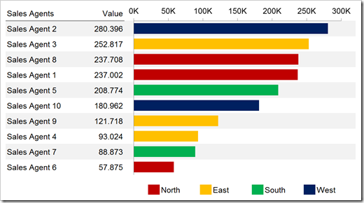
Technique 1 – Several Data Series (Dimension)

Here is an example workbook for free download:

Download Colored Bar Chart Data Series (Categories) – (Excel 2003 workbook, 79K)

You can use exactly the same technique if you want to color code a measure instead of a dimension. All you have to do is to cluster the values in categories, e.g. by defining value ranges or using percentiles.

You would probably use different hues of the same color instead of different colors, like this:
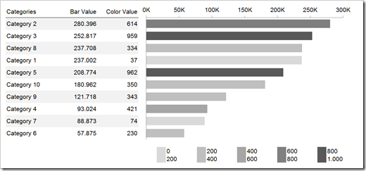
Technique 1 – Several Data Series (Measure)

Here is the according workbook for free download:

Download Colored Bar Chart Data Series (Measures) – (Excel 2003 workbook, 86.5K)

Technique 2 – Change the Fill Color using VBA

You don’t mind using some simple VBA routines in your workbook? Good. A very small VBA sub can automatically change the fill color of the bars. Thus, you need only one data series in your bar chart. The set-up is very similar to technique 1 (color encoding a measure):

  • Define value ranges (as many as you like)
  • Define the color scale using the fill color of cells
  • Use a simple MATCH formula to assign each value to the correct value range
  • The rest is done by a very simple VBA routine looping through all data points in a For Next statement and setting the fill color to the according fill color of the range this value belongs to.

Have a look at the worksheet [calculation] and the small VBA routine of this workbook:

Download Colored Bar Chart Fill Color (VBA) – (Excel 2003 workbook, 89K)

The VBA sub “ColorBarChart” is assigned to the spinner on the dashboard, i.e. the coloring changes each time you are switching to another data set. Of course, you could also call this sub from a Worksheet_Calculate or any other event driven procedure.

Technique 3 – Change the Transparencies using VBA

This technique is limited to Excel 2007 or later. Like technique 2, it uses VBA. However, it does not change the fill color of the bars, but the transparencies. The set-up of the workbook is easier than with the other 2 techniques. Like technique 2, you need only one data series in your bar chart. You do not have to define range values, all you have to do is to create a helper column calculating the transparency values with a pretty simply formula.

Here is an example how this would look like:
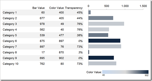
Technique 3 – Transparencies

The VBA procedure is very similar to the one used for technique 2. Instead of changing the property .Interior.ColorIndex, it changes .Fill.Format.Transparency, using the percentage values in the helper column (see above).

That’s it. One helper column and 8 lines of VBA code and you are good to go.

Here is the workbook for free download:

Download Colored Bar Chart Transparencies (VBA) – (Excel 2007 workbook, 28.8K)

Please use this with caution

Color coding is a very interesting way of visualizing data, no doubt about it. However, you should always think twice before using it. From my point of view, color coding sales regions of agents (as shown in the example for technique 1) adds a lot of very useful information. Imagine the bar chart would include more than 10 agents. You could easily see from the colors of the bar that e.g. 5 out of 10 of the top performers are coming from one sales region.

However, human eyes respectively the human brain are not very good in comparing values by color hues. For instance I would not recommend using a bar chart displaying the revenues of your company branches as the bars and their profits as the color. I would use 2 aligned bar charts instead. This makes both KPIs comparable at a glance.

Still, I do believe there are some use cases where coloring bars can be a viable alternative. All you have to do is to thoroughly think about which visualization tells your story best.

A Practical Example – A Color Coded Tornado Chart
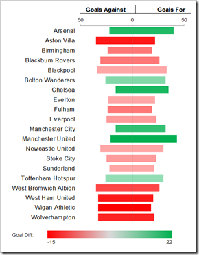
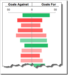
Colored Tornado ChartThe recent post described my “non-entry” to the The Tableau Interactive Sports "Viz" Contest: The History of Premier League Statistics.

This Tableau workbook included a variety of tables and visualizations and one of them used color coded bar charts: Dashboard 2 contained a chart showing the goals of each team at any point in time: Goals for, goals against and goal difference.

A tornado chart is not far to seek for this data set. One bar for each team, goals for on the right of the vertical axis and goals against on the left. This is pretty intuitive, I think.

But what about the goal difference? Sure, the bars leaning to the right are the ones with the better goal difference and vice versa. However, have a look at the example shown above. Imagine you would not have the color coding, would you be able to see at a glance that Aston Villa’s goal difference is worse than the one of Blackburn Rovers or that Liverpool’s goal difference is negative? I do not think so.

Thus, from my point of view this is a very good example of how to effectively use color coding on a bar or tornado chart. Sure, you can always add another bar chart displaying the goal differences, but if you are short of real estate on your dashboard, color coding can be a viable alternative in this case.

The implementation isn’t too difficult. It somehow is a combination of technique 1 and 3: four data series in the chart and a slightly changed VBA routine adjusting the transparencies of all 4 data series. Nothing new under the sun. Here is the example workbook for free download:

Download Colored Tornado Chart – (Excel 2007 workbook, 60.1K)

Acknowledgements

Many thanks go again to my friend Dan L, who was once more kind enough to invest some of his precious time reviewing my ideas and workbooks. A big time thank you very much, Dan. Your feedback is invaluable.

What’s next?

I am planning to have two Tableau articles during the next weeks: a new Tableau Quick Tip and an article on the making of the Premier League Historical Statistics.

If you are more interested in articles on Microsoft Excel, please hang in there. I am also working on a follow-up post to the Pivot Table with texts in the value area and on an article about how to drill-down within an Excel dashboard.

Stay tuned.

Comments

33 responses to “Color Coded Bar Charts with Microsoft Excel”

  1. Daniel Avatar
    Daniel

    Great post as usual!

  2. Jay Avatar
    Jay

    wow very informative Robert
    love the concept behind the tornado graphing, i was wondering if it would be useful to show on # of new customers won vs # of existing customers?

  3. Robert Avatar

    Jay,
    thanks for your comment. Most often, a tornado chart is used to visualize a population pyramid, like Daniel Ferry does here. It compares the population divided into male and female by age buckets.
    This is probably the most effective use case for a tornado chart and I recommend using this chart type only for data sets that are somehow similar.
    If you want to show the number of new customers compared to the existing customer base, I would not go with a tornado chart. I would rather create a KPI “new customers in % of customer base” and use a simple bar chart. This is more effective from my point of view.

  4. Ulrik Avatar
    Ulrik

    Great article with a lot of cleverly thought out and quick-to-apply techniques – thanks for the inspiration!
    I think your words of caution are important. Colors and hues are intriguing and fun elements to play with when doing charts and dashboards, but if not used carefully and in moderation, the display runs the risk of not conveying the information it is supposed to. Mostly because there is too much to interpret and too many things calling for attention. I’d tend to say, if you have the real estate, fit in the extra bar chart needed to display the extra dimension instead. I don’t think it constitutes a problem in your fine examples, that serve perfectly to illustrate the technique, I just find it important to remember when constructing dashboards in general.
    Your examples made me think that applying color coding to performance measures, e.g. quartiles or percentiles, could actually be a great way of quickly showing how categories (e.g. agents) perform across multiple measures. I.e., you apply the same quartile/percentile color coding on all charts, perhaps in combination with some other technique for distinguishing between categories and/or conducting brushing.

  5. Tom Avatar
    Tom

    Excellent post. Looking forward to the dashboard drill down post as well – I’m experimenting with that right now.

  6. Robert Avatar

    Ulrik,
    many thanks for your comment and your kind words. I couldn’t agree more. You have to be very careful with color encoding.
    Actually, your comment is exactly what I wanted to say in my “Please use this with caution” section. However, I have to admit, your statements are definitely more eloquent, clearer and simpler. Thanks a lot!

  7. Robert Avatar

    Tom,
    thank you very much for your comment. My idea of drilling down from an Excel dashboard to more detailed information on one selected item is very simple. However, maybe you will like it exactly for its simplicity.
    Please hang in there, I am planning to publish this article within the next few weeks. If you want to discuss your ideas and thoughts prior to my article, I would appreciate an email. Thanks!

  8. dan l Avatar
    dan l

    To add my 2 cents:
    I implemented this with ‘buckets’ of percent transparency 0, 15, 30, 45. It seemed to work rather well. But then again, my colors were based on a value that was independent of what was being displayed to begin with.

  9. Tips For Excel Avatar

    changing the transparencies by using VBA produces a real charmer of a graph. Looks a bit like a tableau public chart. Nice post.

  10. Robert Avatar

    Dan,
    many thanks for your comment.
    Like Ulrik said in his comment above, color coding bars with the values of another data series “runs the risk of not conveying the information it is supposed to. Mostly because there is too much to interpret and too many things calling for attention.”
    Not much to add, I guess.
    The categorical color coding (i.e. the sales region approach of the first example) is easy to understand, I think. Using another measure (even if it is clustered to categories) is a different story. It always depends on your situation / data / requirements.
    Though, I am still convinced there are some use cases where color coding bars can be a good way of adding more information to the same chart. I hoped, the football goal tornado chart would be one of them.
    Last, but not least, I think adding a meaningful, clear and simple legend is very important. As long as you tell your readers what they are looking at, you should be ok.

  11. dan l Avatar
    dan l

    Which brings up something I meant to ask before:
    Are those legends done with the drawing tool?

  12. dan l Avatar
    dan l

    I would imagine it could be done, but it would probably be a little tedious.

  13. Robert Avatar

    Dan,
    like Dan (l) said, both charts are possible with Microsoft Excel, but the charts are not built-in. However, with some know-how, you can do these charts in Excel.
    The first one is basically a column chart with variable widths of the columns. Jon Peltier provides a nice tutorial how to create this:
    Variable Width Column Charts (Cascade Charts)
    The second one is a combination of waterfall charts. It is again Jon, who shows us how to do this:
    Excel Waterfall Charts (Bridge Charts)
    I hope this will be helpful.

  14. Robert Avatar

    Dan,
    many thanks for your comment.
    All legends are inserted manually. The legends in the first 2 workbooks are simply using fill colors of cells and values in cells. The legends in the other 2 workbooks are using a combination of a text in a cell (e.g. “Goal Diff.”), a rectangle shape (formatted with a color gradient fill) and 2 textboxes linked to 2 cells (min and max of the range). The gradient fill of the rectangle does not change according to the data displayed on the chart, but I think it is close enough to inform the reader about what he is looking at.

  15. paresh Avatar

    A wonderful post ! Really useful.

  16. Marko Avatar
    Marko

    Great and very useful…once again you had outdone yourself Robert.
    Will you be posting any new blogs? Im excited and looking forward to it.

  17. Robert Avatar

    Marko,
    many thanks for your comment.
    I know, it has been quite a while since my last post, but unfortunately I am very busy at the moment with my project assignments. I am working on some new blog posts, but I don’t know yet when I will be able to publish.
    Please hang in, there are some interesting things to come (Excel and Tableau).

  18. Marko Avatar
    Marko

    Robert, I am looking forward to your new blogs 🙂

  19. Passingby Avatar
    Passingby

    This site dead?

  20. Robert Avatar

    No, not yet.
    I have been very busy with my paid work during the past few months and wasn’t able to work on new blog posts. With a little help from my friends, there will be a couple of new articles until end of this year, mainly on Tableau, but also at least one new post on Excel.
    Please hang in there. Simply subscribe by RSS or email and you will not miss a thing.

  21. marko Avatar
    marko

    Robert
    Great post….I cant seem to download the tornado graph. It opens up a folder when I download but cannot seem to download the actual excel file?

  22. Robert Avatar

    Marko,
    it is an Excel 2007 / 2010 workbook. An Excel 2007 / 2010 file is nothing else than a zipped container with a couple of folders and XML files. I suspect you don’t have Office 2007 / 2010 installed and when clicking on the link, Windows Explorer opens the file as a zip file and displays the content.
    Right click on the link, select Save Target As and store the file on your computer.

  23. Ramon Andrews Avatar

    This is a very helpful post on Excel techniques. Those who frequently use the application are surely grateful of these information. Thank you for sharing.

  24. Clarissa Lucas Avatar

    A very informative article in using Excel. Thank you for posting such a very helpful read.

  25. Mary Avatar
    Mary

    Every time i start color coding stuff in excel, i end up spending WAY too much time with it. I always want to make the colors easy to distinguish, and when you have like 20 different things you run out of colors very quickly. I blame my dad for being a perfectionist, since i somehow inherited that. For that reason, i would like to apply automatic color scales (based on values, im not sure how to explain it, im talking about something like this: http://www.excel-aid.com/excel-color-scale-customizing-the-color-scale-format-2.html , but for charts and not cells). Im aware that it will only work (=make sense) with some charts, and maybe it cant even be done. So its basically the thing you did with the transparency i guess, but without VBA and in color. Is that possible. Please consider that im not really experienced in excel and not a native speaker, so maybe if you basically answered this question in the text, my apology.

  26. Robert Avatar

    Mary,
    I agree, coloring charts can be a very tedious task. The most flexible way of coloring charts is probably writing your own VBA routine. As always, VBA gives you full control over what you want to do and how you want to do it. However, it requires VBA knowledge and writing and testing the routine require some one-time extra effort and time.
    Having said that, there are a few options how to make coloring charts faster without VBA. Here are some ideas:
    1. Use the chart style templates. You can add your own chart style template by formatting a chart and then right click on it and save it as a template. You can then apply the same formatting to every new chart with only 2 or 3 mouse clicks
    2. If you have Excel 2010 or 2013, you can also use the predfined color scales (Change Colors on the Design tab)
    3. You can also select an existing chart (which already looks the way you want it to look), copy it, select a new chart and transfer the formatting by clicking Paste|Paste Special|Formats.
    I guess there are many more tricks for chart formatting, but I think these three should already save some time.

  27. avneet Avatar
    avneet

    Hi Robert
    Great post.
    One problem which I am facing though is with ‘Technique 2 – Change the Fill Color using VBA’. If you use it in excel it isn’t picking the right color. It changes the color to the nearest match as the excel 2003.
    Thanks
    Avneet

  28. Robert Avatar

    Avneet,
    if you are using Excel 2007 or later and want to take advantage of the full color palette, you have to make a small adjustment in the code:
    Replace
    .Interior.ColorIndex
    by
    .Interior.Color
    (both occurrences) and it should work.

  29. Ramon Andrews Avatar

    This is a very helpful article on Microsoft Excel. Thank you for posting.

  30. Charles Avatar
    Charles

    I know this is an old post, but it provides a solution I needed. I am trying to incorporate this into one of my own spreadsheets and cannot figure out what causes the Sub ColorBarChart() to run. Changing the selection value on the sheet “Bar Chart” makes Sub ColorBarChart()run, but how?

  31. Robert Avatar

    Charles,
    the sub is assigned to the spinner form control. Right click on the spinner, select Assign Macro, select the sub and click Ok.

  32. cheng Avatar
    cheng

    Thanks! Awesome Post…

Leave a Reply

Your email address will not be published. Required fields are marked *