Support your ad-hoc analysis and exploration of new data with Tableau's Summary Card
 I decided to start a new little category of posts here on Clearly and Simply: Tableau Quick Tips. Today’s post could be the first one in a series of very short articles describing some of the little nuggets in Tableau’s functionality.
Let’s give it a try with a quick hint on Tableau’s Summary Card.
We had a couple of posts here using Tableau as the benchmark for Microsoft Excel (Matt Gram’s fabulous guest post Bluffing a Visual Cross-tab with Excel, Bluffing Tableau Actions with Microsoft Excel or The Next Level of Interactive Microsoft Excel Dashboards). This time it is Microsoft Excel’s turn to serve as a benchmark for Tableau.
Microsoft Excel’s status bar provides a lot of additional information on the range of selected cells. Select any given range of the active worksheet and Excel automatically calculates and displays various consolidated results at the bottom right in the status bar:

I am sure you are aware of this. In versions 2003 or earlier you could only select one of the calculations (sum or average or minimum, etc.). Excel 2007 and 2010 now provide the option to show the average, the sum, the minimum, the maximum, the count and the numerical count at the same time.
This is an extremely helpful feature for ad-hoc data analysis, for exploring new data, for plausibility checks and much more. You do not have to write formulas in cells. Simply select a range and look at the status bar. A time saving feature and I am using this all the time.
Tableau has something very similar. It is in the status bar as well, but at the bottom left:

Tableau shows the number of marks selected, the number of data rows included in the selection and the sum of the primary measure of all data points selected. As I said similar to Excel, but there are two shortcomings:
- Tableau only shows the sum of the values, no average, no minimum, no maximum
- If you are displaying several measures in your view (e.g. you have [Sales] on the Size Shelf and [Profit] on the Color Shelf), Tableau only shows the primary measure (in our example [Sales])
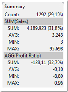
You may or may not be aware of it, but there is one step up: The Summary Card. Select it in the View Card toolbar or click in the main menu on View and select Summary Card. You will see a card like this:

It works the same way as the status bar: it shows additional information on the selection or (if you didn’t select anything) on the entire data source. However, it provides much more information than the status bar: sum, average, minimum and maximum. And – even more important – it shows these values for all measures used in your visualization.
As I said above, a very helpful feature, especially if you are exploring new data sets or doing ad-hoc data analysis. The Summary Card is one of the first things I add to my Tableau worksheets. Actually, I think it would be nice, if Tableau would show the card by default.
Finally, please let me know what you are thinking of the new category: interesting little bits of information or am I just carrying coals to Newcastle? Please leave me a comment, whether you want me to continue or to stop the Tableau Quick Tips. Thanks!
In any case, please stay tuned.
Leave a Reply