Techniques to implement the Site Catchment Analysis of Germany in Microsoft Excel
 I am sure you are already fed up with articles on Site Catchment Analysis here. I swear it was not my intention to have such an avalanche on this topic here. But it turned out to be a very good example to demonstrate different interesting ideas in Tableau and Excel. After using this example for a how-to tutorial on Calculated Fields in Tableau, I wrote an update for Tableau 6 (Site Catchment Analysis with Tableau 6) and Richard Leeke was kind enough to provide a fabulous guest post series (part 1, part 2, part 3) with excellent insights on how table calculations work in Tableau, also based on the Site Catchment showcase. I finally couldn’t resist to use the example again and showed how this would look like in Microsoft Excel: Microsoft Excel Site Catchment Analysis (Part 1). Since the Excel model is quite a complex workbook, I decided to split this up again into a 2-post series.
So, please bear with me, I have to bring this to an end now. Today’s post provides some more details on the Site Catchment Analysis of Germany with Microsoft Excel.
The purpose of this article – details on the implementation
The first part of this 2-part-series included already the workbook for free download. The article itself, however only described the background, the challenge and the features of the model without any information on the implementation.
Today’s second part will not provide a detailed how-to tutorial either. However, if you want to dissect the model to understand how it was implemented, the article will point to the details you should to look at and give you some background information about the set-up, the functions, the charts, the interactive features, the extensive use of named formulas and the VBA to find the optimal center.
The Basics – the Structure and the Formulas
If you already downloaded Microsoft Excel workbooks from this blog, you are probably familiar with the way I am structuring my models. I am always separating the raw data, the calculations and the display (dashboard) in different worksheets. The model at hand is no exception. The worksheets are called “Dashboard”, “Data” and “Calculations”. No further explanation necessary, I guess.
The formula cells of the worksheet “Calculations” include some very simple stuff like direct links to other ranges, basic arithmetic operations, SUM, IF, COUNT and some others. Even the more advanced formulas aren’t too difficult to understand: INDEX, MATCH, SUMPRODUCT and 2 simple array formulas. That’s all. I guess there is nothing in you haven’t seen before´and I do not have to provide a detailed explanation.
The Charts
The charts used on the dashboard are also pretty simple: 4 standard embedded pie charts and one standard embedded bar chart.
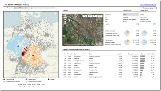
The only more advanced visualization is the map. It is a bubble chart with 6 data series: all locations, optimal center, optimal catchment area, selected center, selected catchment area and the overlap of postcodes belonging to the optimal and the selected catchment area. Besides the interactivity (see next section), there are only 2 things you should notice:
- The source of the data series are named formulas (see below for the details)
- The background (chart area) is filled with a Tableau lookalike map of Germany
The Interactivity of the Dashboard
Nothing new under the sun: the workbook provides pretty much the same interactive features I already described in Bluffing Tableau Actions with Excel: Besides selecting one specific postcode by entering it in the grey cell top right, you may also click on any given data point on the map, on a row of the data table or on a data point of the bar chart. After doing so, the selected center will be updated on the whole dashboard and the Webbrowser will show the according Google Map view. For more details on how this is done, please refer to the original article Bluffing Tableau Actions with Excel.
Named Formulas
If you already downloaded the workbook you may have noticed that the worksheet “Calculations” is pretty small: 186 used cells in total, only 94 cells including formulas. How come? We are performing quite complex calculations on a relatively big set of raw data (8,176 postcodes). Where are all the calculations, e.g. the calculation of the distances of all postcodes from the selected center or the optimal center?
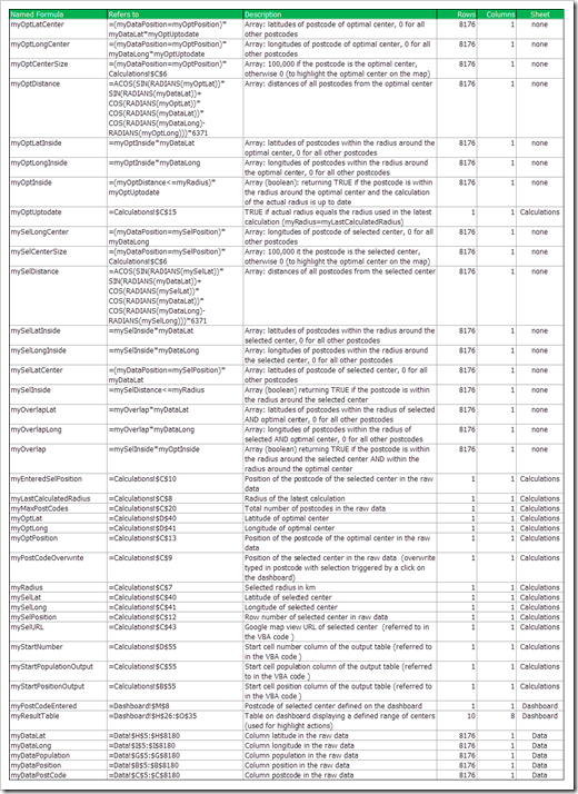
Well, they are all done in names. The model makes extensive use of names. The workbook includes 40 named formulas, 17 of them are returning an array with 8,176 rows and one column. The following table provides all named formulas: their names, the formula / cell reference, a brief description, the size and the worksheet they are defined on:
If you want to have a closer look, here is a small Excel workbook including this table for free download:
Download Named Formulas Site Catchment Analysis (Microsoft Excel 2010, 13.6K)
Of course you could also perform all these calculations in worksheet ranges. But there are a lot of different formulas to be calculated for all 8,176 postcodes. This would bloat the workbook. That’s why I decided to use named formulas instead, resulting in a smaller file size and – I think – in better performance. However there is a drawback coming with this technique as well: the workbook is harder to read and understand. If you pass on the model to someone else, it is probably harder to understand how it is working.
The VBA to calculate the optimal center
There are 2 main VBA parts included: The first one provides the interactivity of the dashboard. This is already described here: Bluffing Tableau Actions with Excel.
The second part of the VBA calculates the optimal center based on the selected radius. Every time the user changes the radius, he has to rerun a VBA sub called “FindOptimalCenter” by clicking on the button at top right of the dashboard. The model checks if a recalculation is necessary and shows a hint on the dashboard highlighted with a red fill color close to this button.
There isn’t much intelligence in this code. In less than 150 lines of code, a simple enumeration is conducted, resulting in a matrix of distances from each postcode to each postcode in kilometers. Based on this matrix, the optimal center is identified, i.e. the postcode with the maximum population within the given radius and the main results are written to the worksheet “Calculations”. If you are interested in the details, have a look at the code in the workbook provided for download below.
I have to admit that the VBA is everything else than optimized code. Since running this sub is only necessary after changing the radius and since the recalculation takes less than a minute on my computer, I decided not to invest much more time on optimizing the code. However, if you have ideas on how to improve it, I would highly appreciate if you would take the time to write a comment and tell me about it.
The Results
After all this theory, here is a screenshot of the dashboard again to keep you motivated to have a closer look on the model:
The Download Link
And here is the model again for for free download:
Download Site Catchment Analysis Germany (Microsoft Excel 2003, zipped, 2156.9K)
What’s next?
That’s it with the Site Catchment Analysis. I promise. I have not yet decided what I will publish next, but I am already having a couple of ideas for Tableau related articles, Excel visualizations and some Project Management tools.
Stay tuned.


Leave a Reply