Visualize Football League statistics on an Excel Dashboard integrating charts directly into a table
 Combining tables and charts is a very powerful technique for creating Microsoft Excel dashboards. It allows you to integrate texts, values and visualizations into one table. This ensures to have the maximum of information at a glance, including a direct comparability row by row.
I already used this technique in several posts before, like the Sparklines for XL showcase or the Software Project Dashboard examples. Today’s article provides another showcase for a dashboard combining tables and charts.
Football rules the world, especially these days. We are all impatiently waiting for the FIFA World Cup in South Africa, aren’t we? My friend Chandoo recently had a very nice post on visualizing the different footballs used in the World Championships since 1930. That’s remarkable, because Chandoo lives in India and I suppose he is more interested in cricket than football. But as I said, football rules the world these days.
That’s why it somehow suggests itself to use a football-related visualization for today’s post. But I will not go for the FIFA World Cups. Not yet. Today’s article shows how to visualize national football league statistics using a dashboard that combines tables and charts. As always including the Microsoft Excel workbook for free download.
The show case
The idea of this show case is as simple as can be. Let’s assume we have all results of all seasons of a national football league in one Excel table, i.e. the season, the match day, the home team, the away team, the goals of the home team and the goals of the away team:
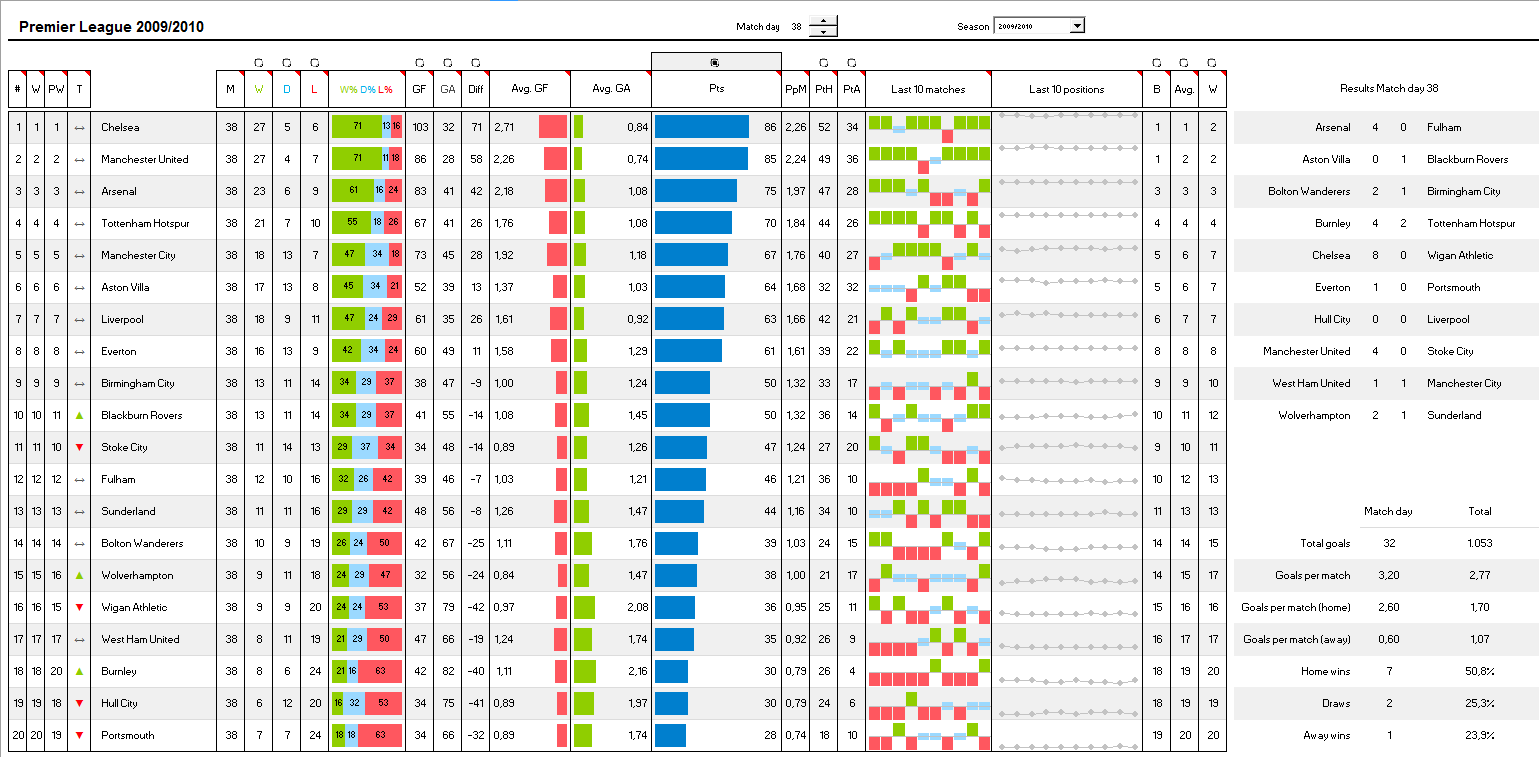
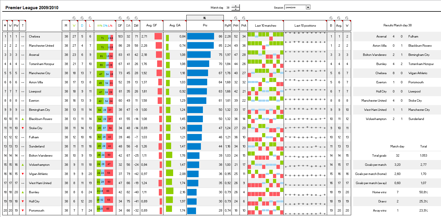
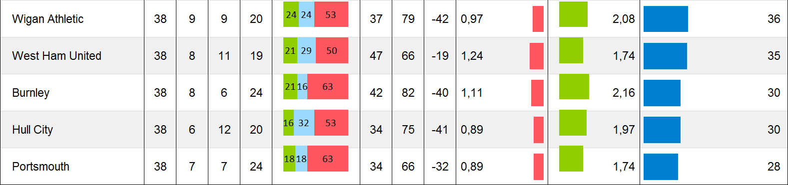
 The challenge is to automatically transfer this raw data into an interactive dashboard showing the actual table for any given match day in any given season, including an overview of the results of the selected match day, further statistics on the match day and some sort options:
 The structure of the workbook

The workbook contains 6 worksheets:
- Dashboard
The display: the name is self-explanatory, isn’t it? This worksheet displays the dashboard as shown in the screenshot above
- Results
The raw data: all match results of several seasons (1996/97 till 2009/10 in our example) for one or several football leagues (German 1. and 2. Bundesliga in our example)
- Calculation Table
The heart of the workbook: this is where the action is. The worksheet contains all data consolidation, the sorting algorithm, the set-up of the charts, the match day and overall statistics, etc.
- Calculation Results
The data snapshot: this worksheet provides the relevant snapshot of the raw data, i.e. the results of the season and the league selected by the user
- Calculation Positions
The history: this worksheet contains a data table with all positions of all teams during the whole season. The table is not calculated by using formulas, but rather created by a simple VBA routine
- Control
The interactivity control: the worksheet stores the selection lists and the target cells for the interactive form controls on the dashboard
As already explained here, this reflects the structure of all my Excel models: the data, the calculations and the display on separate worksheets.
The techniques
Creating a football league table, additional visualizations and more statistics from the raw results requires some more complex functions and operations like OFFSET, INDEX, MATCH, LARGE, SMALL, array formulas and others. Furthermore a little trick is needed to implement the formula based sorting algorithm. Detailed information on the used functions can easily be found on other websites and blogs and the sorting technique is already described here. Thus, I will not go into the details of the calculations. I am rather limiting myself to the following two other techniques used in the workbook:
Technique 1 – combine tables and charts on a dashboard
The idea of integrating charts into a table is obvious. The steps to prepare your dashboards are simple:
- Create a table on the dashboard
- Increase the height of the rows. Usually 35 points are enough
- Insert columns where you want to add your visualizations
- Increase the widths of these columns to e.g. 15 to 30 points
- Insert either one chart covering all rows in your table (bar charts or stacked bar charts) or one chart per cell (column charts or line charts)
Especially for the latter, I recommend using sparklines like Fabrice’s Sparklines for XL or Excel’s built-in sparklines (if you are already using Microsoft Excel 2010). If, for whatever reason, you do not want to use sparklines, you can create the charts using standard Excel as well. However, especially the set-up of the charts, the resizing, the positioning and the formatting is laborious work. You have to remove everything from the charts besides the visualization itself, i.e. the gridlines, the caption, the data values, the fill color of the plot area, etc. Sometimes you have to set the scaling of the axes as well.
As I said: laborious work. Here are two tips which might save you some time:
- The ALT-key
Holding the ALT-key pressed during resizing and positioning a chart will make the edges of the chart snap to the cell grid of the Excel workbook. This helps aligning the charts. In Excel 2007 and later, this trick does not only work for the chart object itself, but also for the plot area
- Copy the chart and change the data source
If you have to create several charts (e.g. the column charts or line charts in our example), I recommend creating one chart first and doing all the formatting, axes scaling and resizing for this master. Then copy the master, change the data source of the copy and position it to the right place on your dashboard. Usually this technique is much faster than doing all the formatting again. Another option would be to create all charts, format the first one, select and copy it and paste special formats to the other ones. However, this does not transfer e.g. changes in the axes scaling to the other charts. Thus, I recommend creating a master and simply copy the chart, position the copy and change the data source. From my point of view this is much faster.
Technique 2 – use the workbook calculation and VBA for creating a history table
The basic calculation of the table is based on consolidating the results for one selected match day. However, for visualizing the team trends on the line charts, we need the positions of all teams during the last 10 match days. Of course you could add additional 9 calculation worksheets referring to the according match day. However, this would bloat your workbook, make it harder to maintain and probably decrease the performance.
So here is a better way: use a small VBA routine to create a history table containing the position of all teams during the whole season:
Sub RecalculateTableDev()
Dim varmatchday As Integer
Dim rngMatchDay As Range
Dim rngTableDevStart As Range
Dim rngTablePosition As Range
Application.ScreenUpdating = False
Set rngMatchDay = Range("myMatchDay")
Set rngTableDevStart = Range("myTableDevStart")
Set rngTablePosition = Range("myTablePosition")
Range("myTableDevRange").ClearContents
For varmatchday = 1 To 34
rngMatchDay.Value = varmatchday
rngTableDevStart.Offset(0, varmatchday).Value = rngTablePosition.Value
Next varmatchday
rngMatchDay.Value = 34
Application.ScreenUpdating = True
End Sub
The technique is simple: Loop through all match days, let the Excel workbook do the math and write the positions of the teams to the history table. Finally set the actual match day to the last one (i.e. display the final league table).
Agreed, there is a drawback as well: the VBA takes some to time to create the history table. Though, an update of the history is only necessary if the user switches either to another season or another league. From my point of view this drawback is acceptable.
The download links
Here is the example workbook for the German 1. and 2. Football Bundesliga for free download:
Download Bundesliga (Microsoft Excel 2003, zipped 223.4K)
I can already hear you saying: “who cares for the German Bundesliga”? Well, I do. If you don’t, maybe you will be more interested in the following workbook for the English Premier League:
Download Premier League (Microsoft Excel 2003, zipped 203.0K)
Please be advised that both workbooks are based solely on the match results. Thus, the tables provided within these workbooks do not reflect any possible point penalties because of e.g. breach of license terms, match manipulations, fan riots, etc. The tables are reflecting the sports, nothing else. They do not necessarily represent the official tables.
What’s next?
As already foreshadowed in the introduction, I am planning to do another post on visualizing FIFA World Cup statistics. I am not sure whether I will make it in time (less than 2 weeks left), but I am working on it.
Stay tuned.
Update on Sunday, December 11, 2011
Some readers asked for an update of the workbook including the season 2010/2011 of the English Premier League. Here it is:
Download Premier League until 2010/2011 (Microsoft Excel 2003, zipped 210K)
Leave a Reply